Fashion Rental
Website Redesign
I was contracted as an intern for a fashion rental startup to redesign their website so it felt updated, modern and high-end.
Role
UX UI Intern | Contract
Tools
Adobe Photoshop, Figma, Zoom
Scope
3 Weeks | Spring 2025
Problem
The client needed a website refresh that showcased more modernity and embraced a “high end” experience.
Solution
I redesigned the site based off of the original website concept per clients’ request with new pages and features that made browsing easier while keeping the brand feeling premium.
Impact
The redesign was approved by the client, and I handed off additional feature ideas for future development.
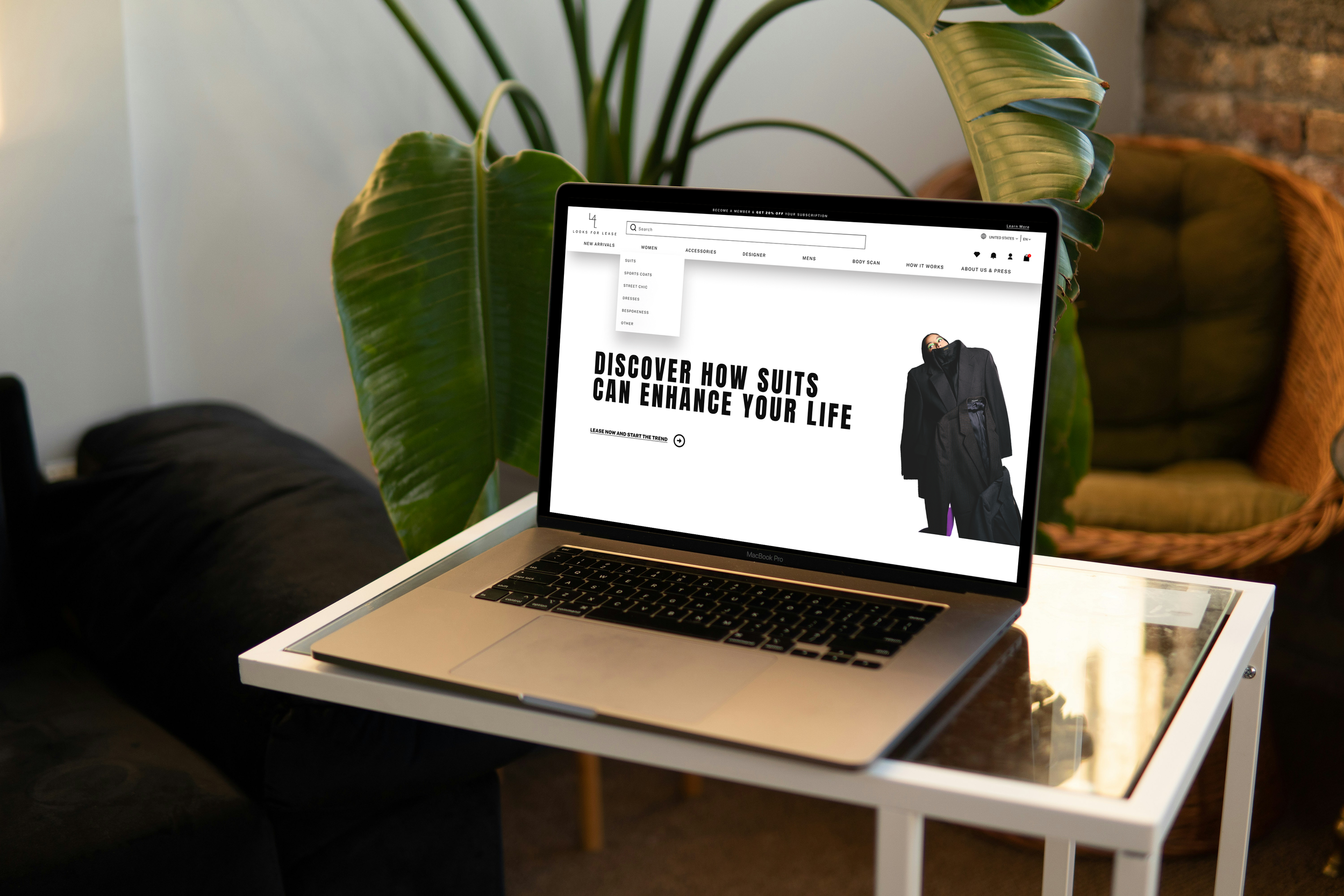
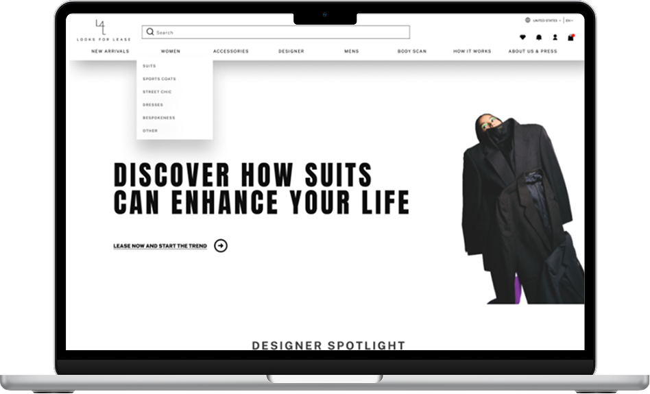
Before
Website Homepage
After
Hero Image Selected by Client
Website Homepage
Designs & Features
Website redesign, which includes new pages & new concepts.
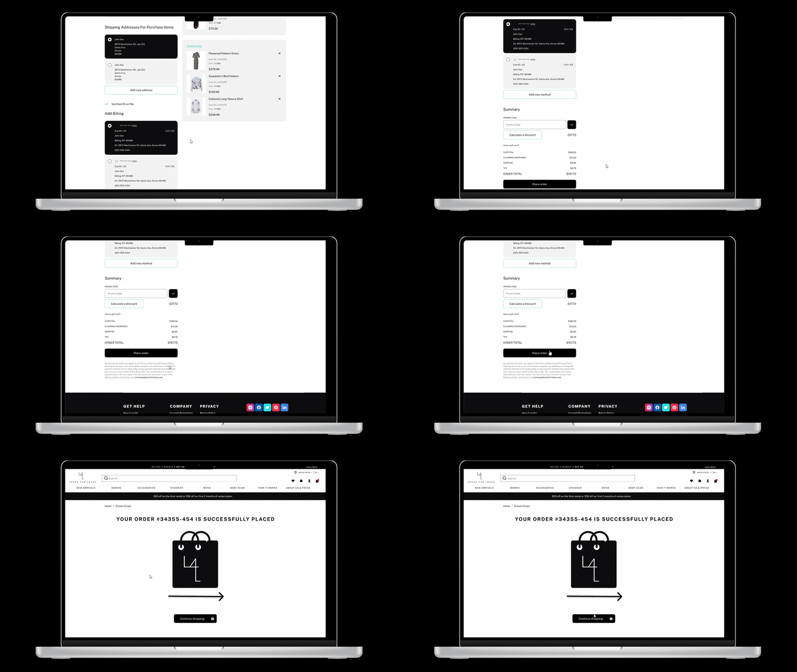
Created a micro-interaction that confirms the add-to-bag action, reducing uncertainty and encouraging users to continue shopping instead of abandoning their cart.
Purchase Feedback Animation
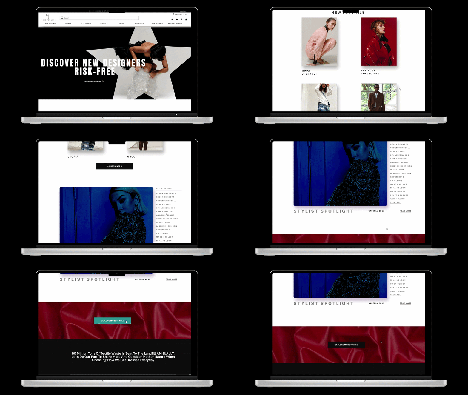
Created an ‘About The Stylist’ feature where clients can learn about stylists’ stories & recommended looks.
Stylist Spotlight via Designer Page
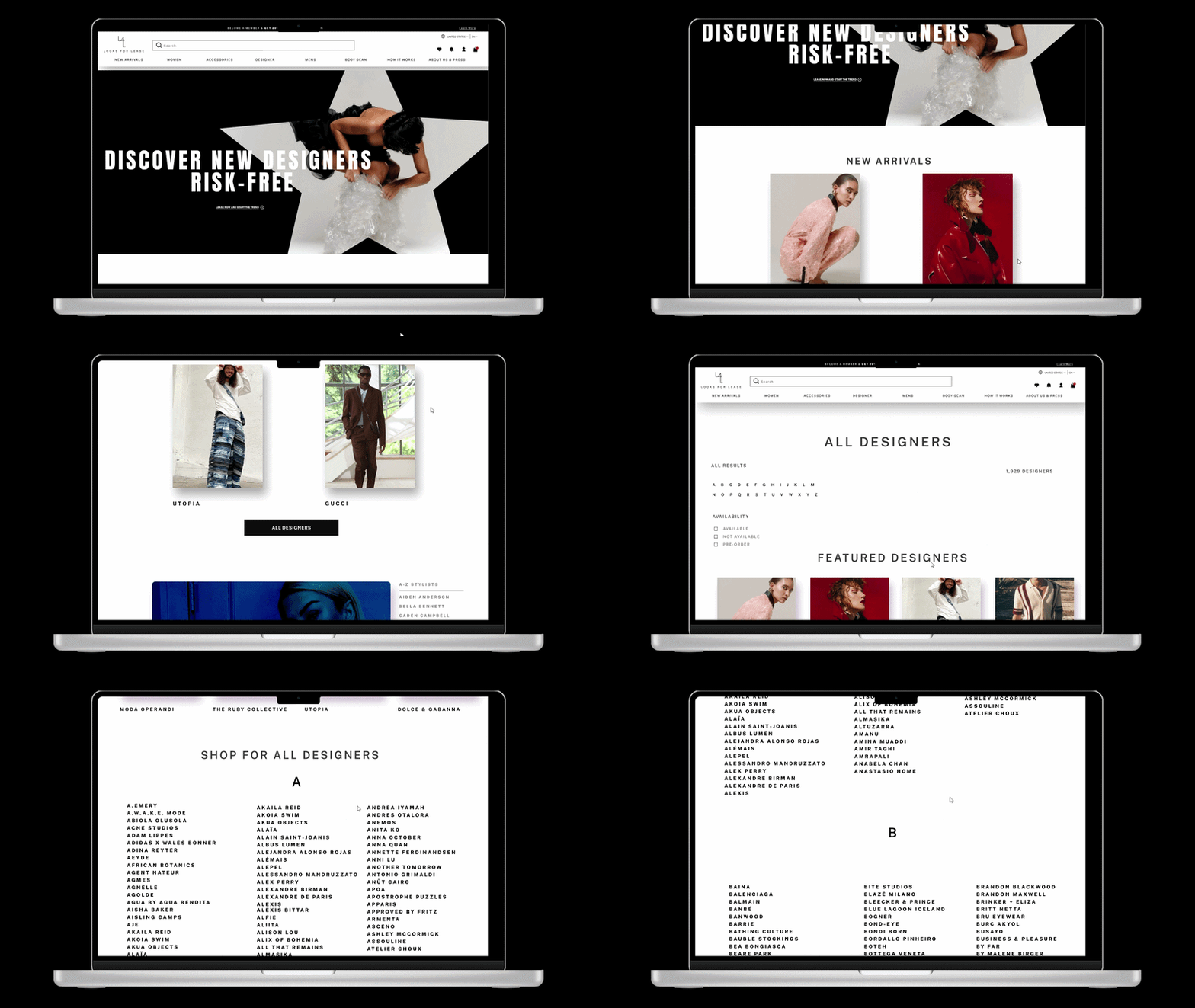
All Designers Page
Created a designer showcase page features all designers partnering with the startup with ease of access through filters by letter, availability, or pre-order.
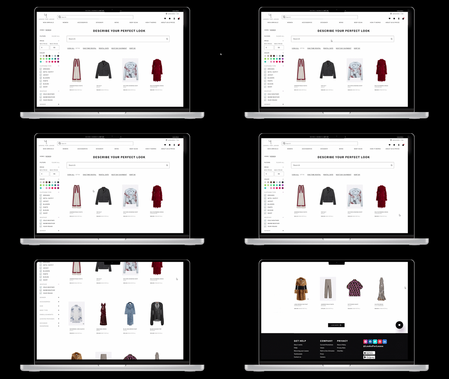
Updated Catalog & AI Search Feature Pitch
Created a "Describe Your Perfect Look." search feature which allows users to search by vibe, theme, or detail (like "long sleeve red sweater").
Stakeholder Kickoff
To begin the process, a meeting with the stakeholders that included the Founder and Creative Director was had to determine the needs and wants, as well as pinning down any challenges that needed to be addressed.
Mood Board
After the competitive analysis I brought my findings into another collaborative session. I organized the founder's and creative director's inspirations into a mood board that guided the site's visual direction.
Competitive Analysis
After the stakeholder kickoff, I researched competitors that reflected the specific aspects the stakeholders most wanted to address within the website redesign. In speaking with the creative director and founder, originality also emerged as a priority, so balancing that with user familiarity became essential. This meant identifying the key elements that make the website both memorable and usable.
Information Architecture
Since this was a redesign, I mapped out architecture that could build on the founder's needs, including revisions midway through the 3-week timeline to incorporate new features. I also emphasized richer visual product information for the consumer, informed by the site's need for a stylist-curated look book, which would help increase product-to-consumer exposure.
Research
Stakeholder Kickoff & Key Insights, Mood Board, Information Architecture, Competitive Analysis
Designs & Features
Website redesign, which includes new pages & new concepts.
Results & Reflections
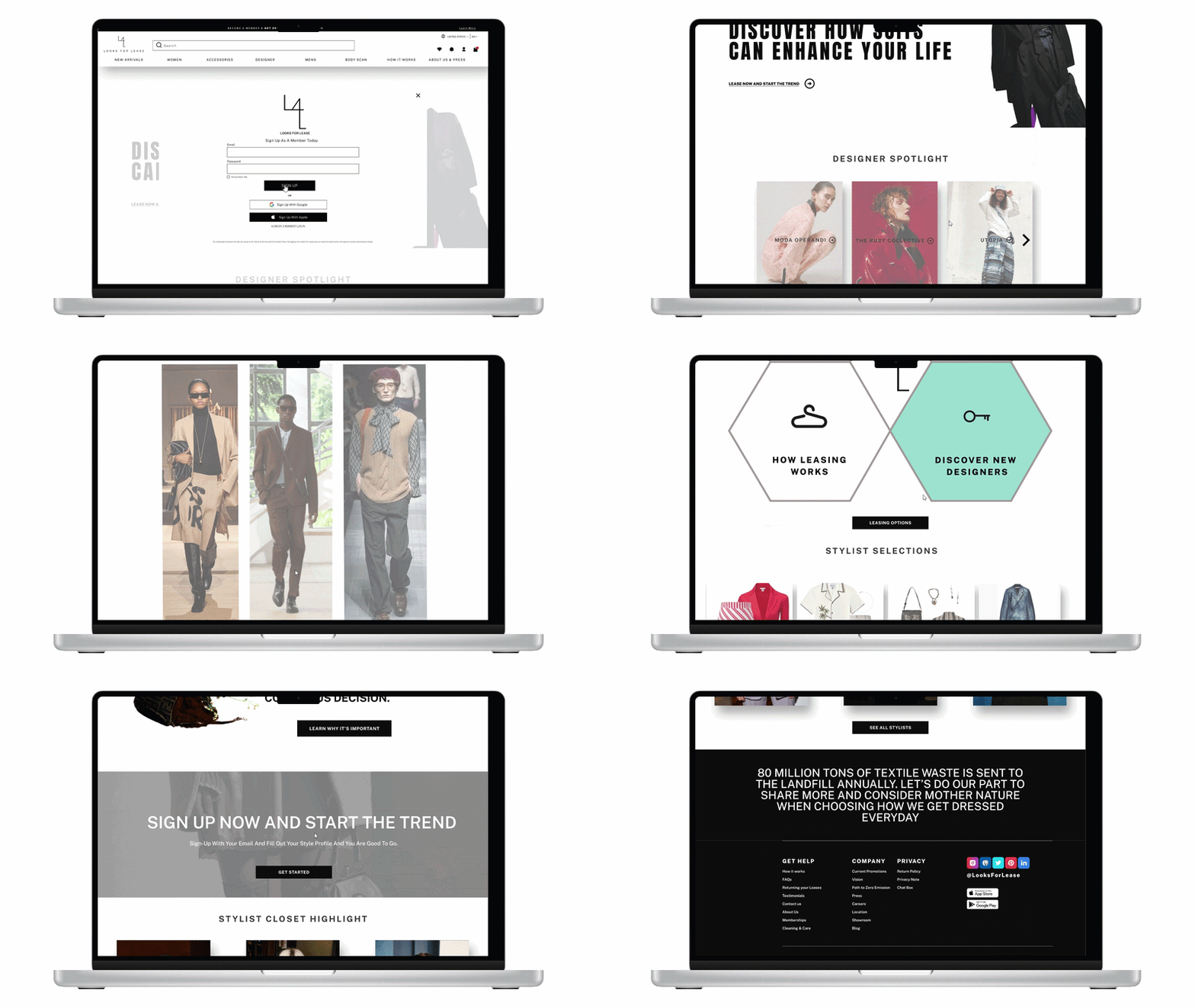
Final Website
Reflection
Working within a three-week timeline taught me to make quick, confident decisions while staying aligned with stakeholders. Looking back, I would have proposed a responsive website that scales to mobile. With more experience and confidence, I would also push for early user testing and user research.