
Fashion Rental Web
& iOS Application Redesign
Looks For Lease is a fashion rental startup that prides itself in forming a circular economy, promoting sustainability while providing high fashion designer pieces to its’ consumers.
During the time of my contract I was tasked with redesigning a website and building the design for the iOS application to coincide to lead with consistency.
Role
Scope
3 Weeks
Tools
Adobe Photoshop, Figma, Zoom
Contract UX UI Intern
Problem
The client needed a website refresh that showcased more modernity and embraced a “high end” experience, as well as an iOS application to meet needs through mobile devices.
Solution
It was possible to design the outlines for the mobile applications after translating client needs into the website. Other features to make the mobile application more interactive were pitched and added as well.
Impact
I was able to provide a redesign that ended with client satisfaction, as well as insights on possible features, providing them for handoff.
Before
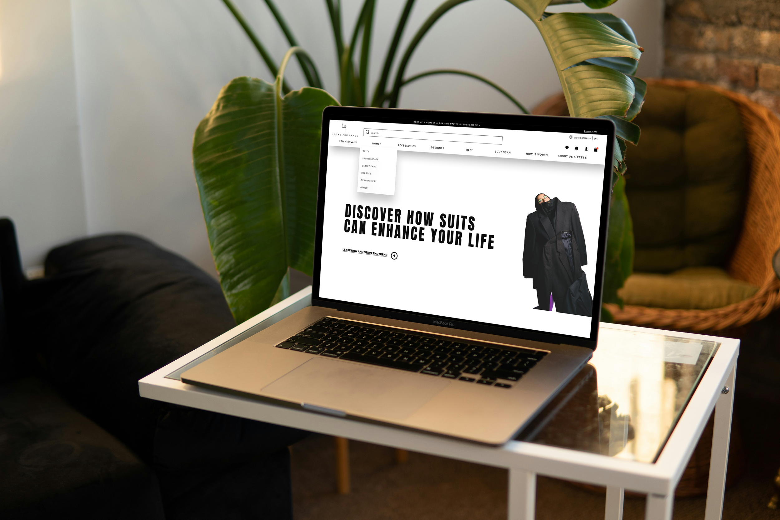
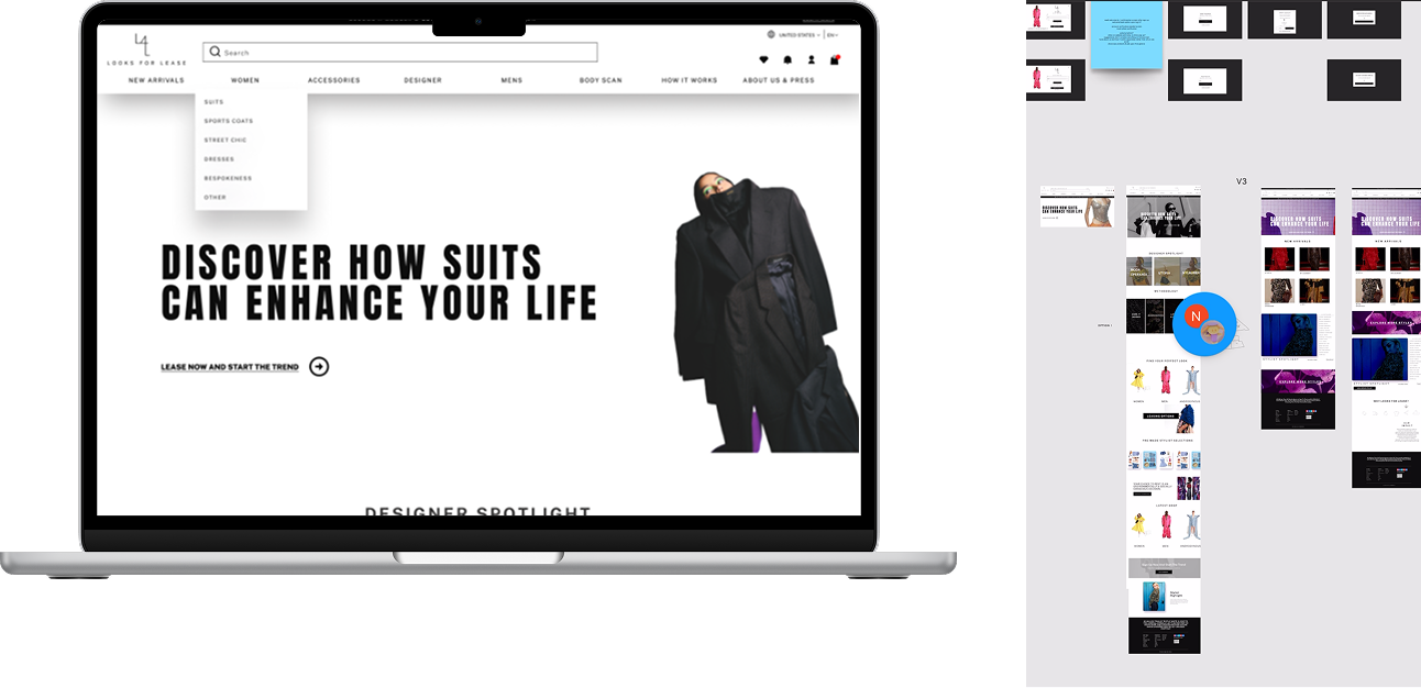
Looks For Lease Website Homepage
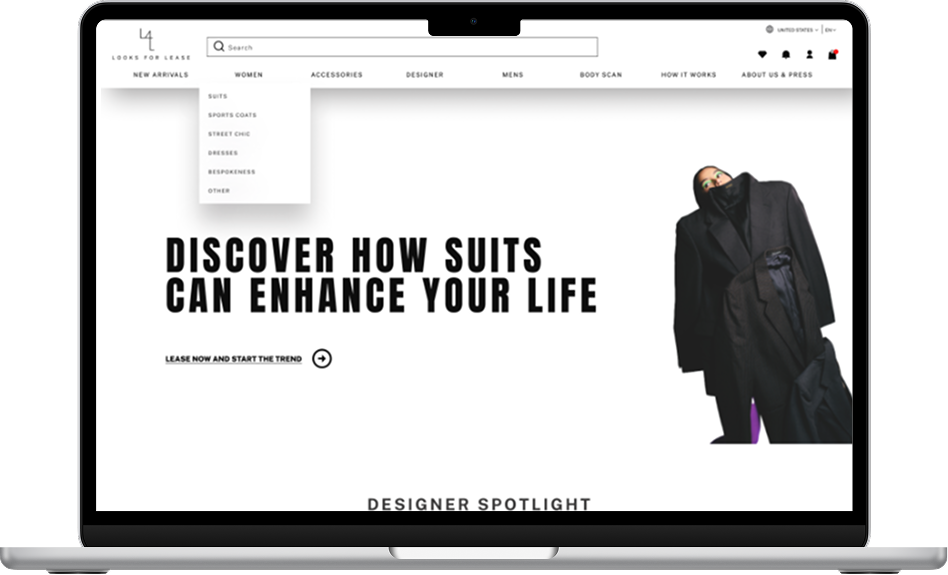
After
Redesigned Website Homepage
Designs & Features
Website redesign, which includes new pages & new concepts, iOS application based off of website with added features including the rental journey of the consumer in terms of returning their rental piece.
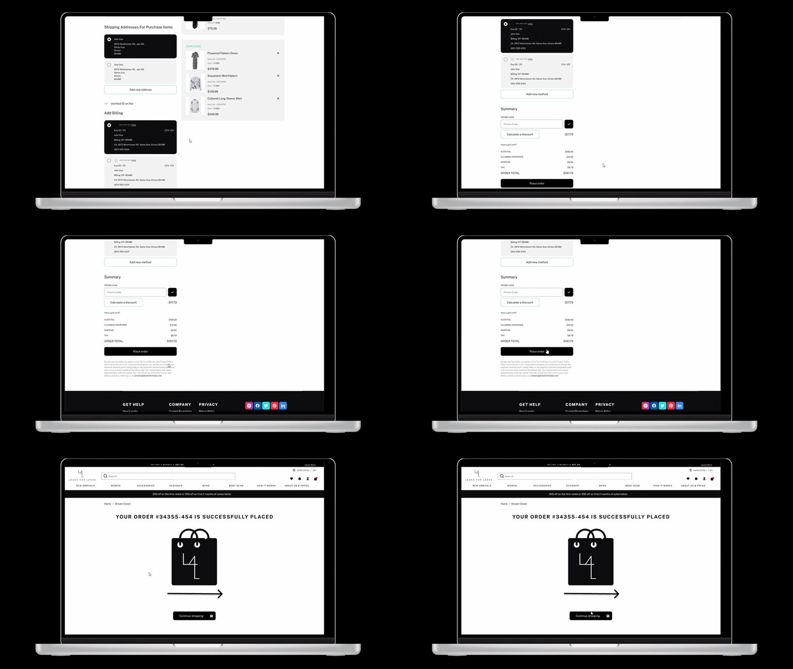
Purchase Feedback Animation
A micro-interaction that confirms the add-to-bag action, reducing uncertainty and encouraging users to continue shopping instead of abandoning their cart.
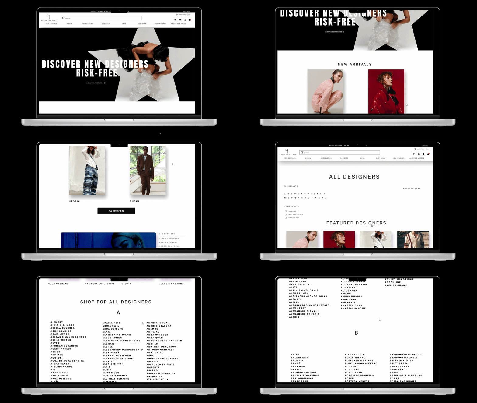
Stylist Spotlight via Designer Page
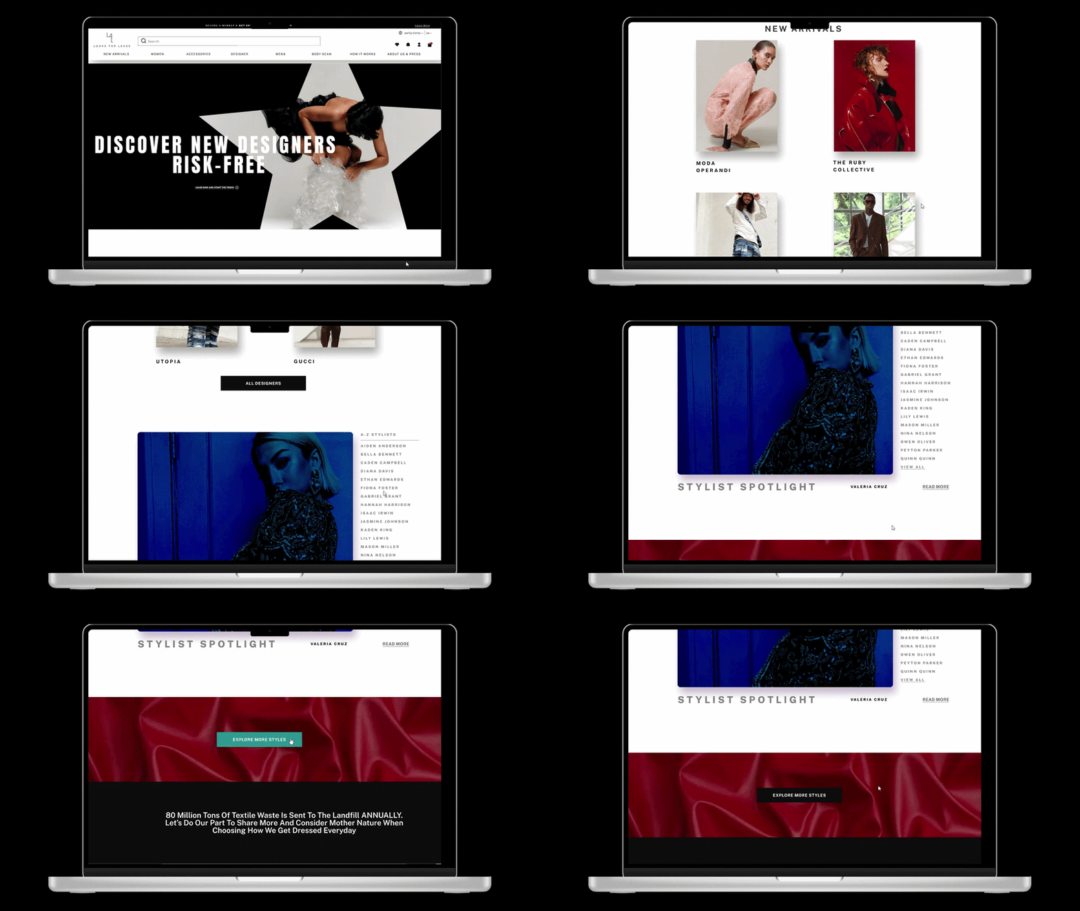
This page showcases highlight stylists to promote special stories, outfits, news publications via the designer page for ease of access.
All Designers Page
Collaborated with founder to find a way to showcase all designers. The page features all designers with ease of access through filters by letter, availability, or pre-order.
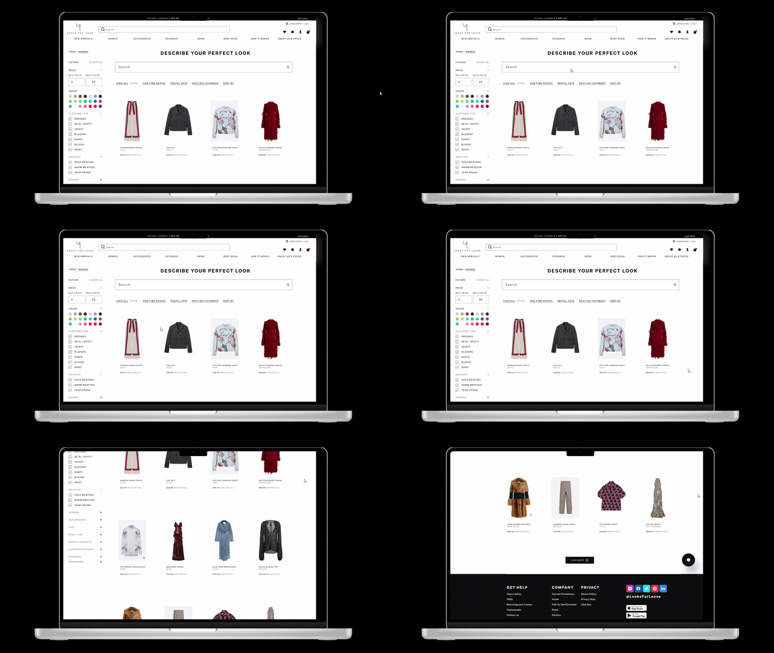
After the catalog update, there was a suggestion to remove the universal search bar. To preserve user accessibility, I pitched a catalog-specific search feature that goes beyond keyword matching: "Describe Your Perfect Look." It lets users search by vibe, theme, or detail (like "long sleeve red sweater"), matching not just the text but the intent behind it.
Updated Catalog & AI Search Feature Pitch
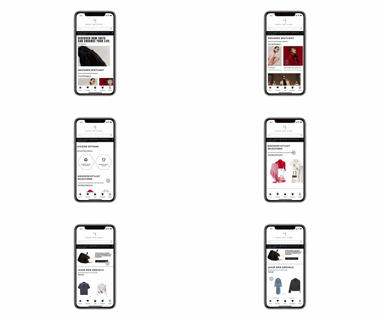
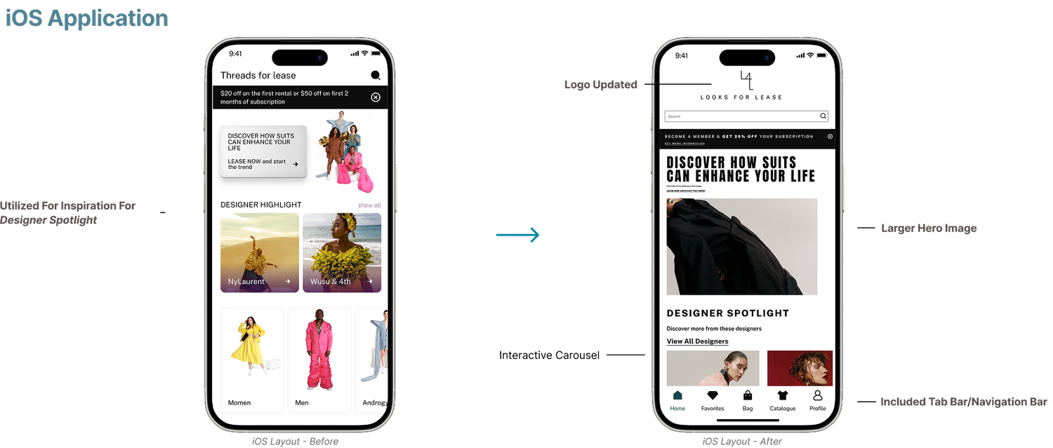
iOS Application
Application homepage after redesigning the website.
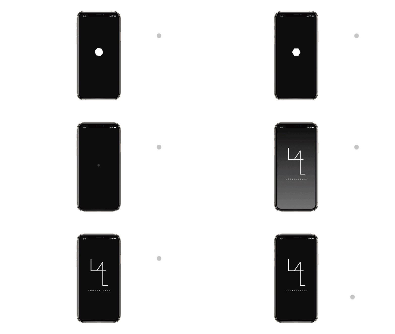
Splash Screen
Made to give visual impact showing branding colors and shapes while app loads to completion.
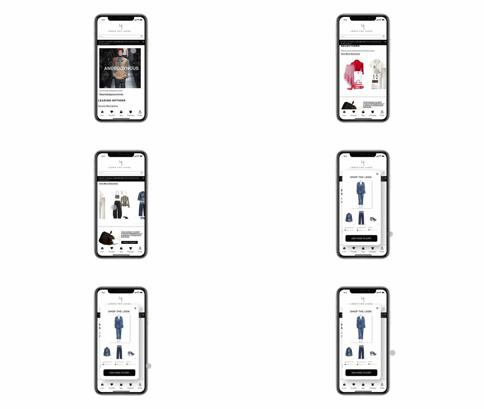
“Shop the Look” is a feature I pitched for the mobile application, where the looks are put together by stylists. It promotes more rental blocks, the stylist as well as gives the consumer trust in finding the perfect outfit combination all in one.
Shop The Look Feature
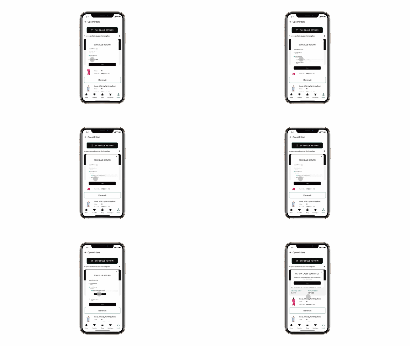
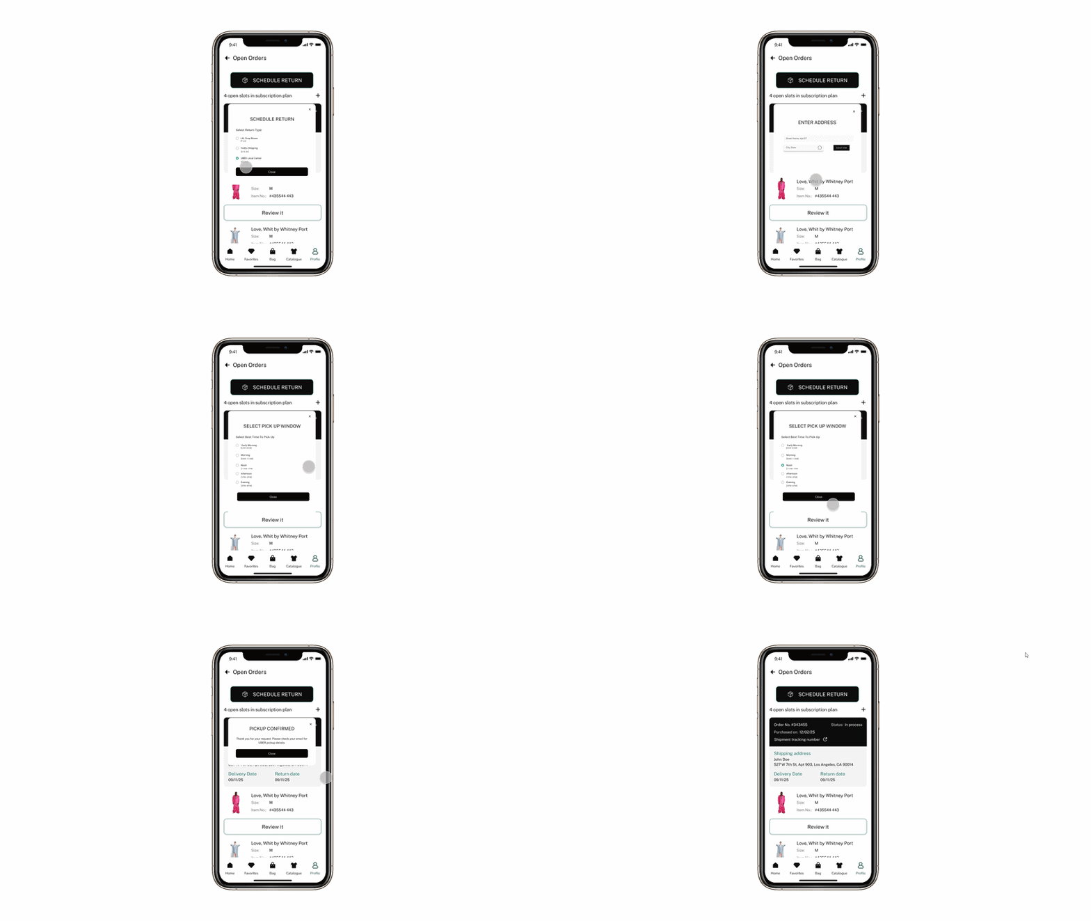
The founder wanted to find a way to visually show the rental drop-off journeys within the app. Given a two-day deadline, I worked independently to develop a clear, cohesive way to showcase these journeys, staying closely aligned with the founder's direction throughout the tight turnaround.
Rental Drop Off Journey
Uber Pickup
Select time to have rental picked up by courier
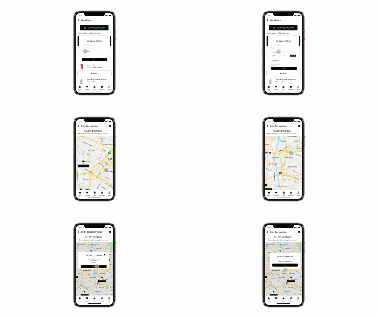
Looks For Lease Dropbox
Dropoff to company dropbox in select locations
Fed-Ex Shipping
Generates shipping label for mailing
Style Guide
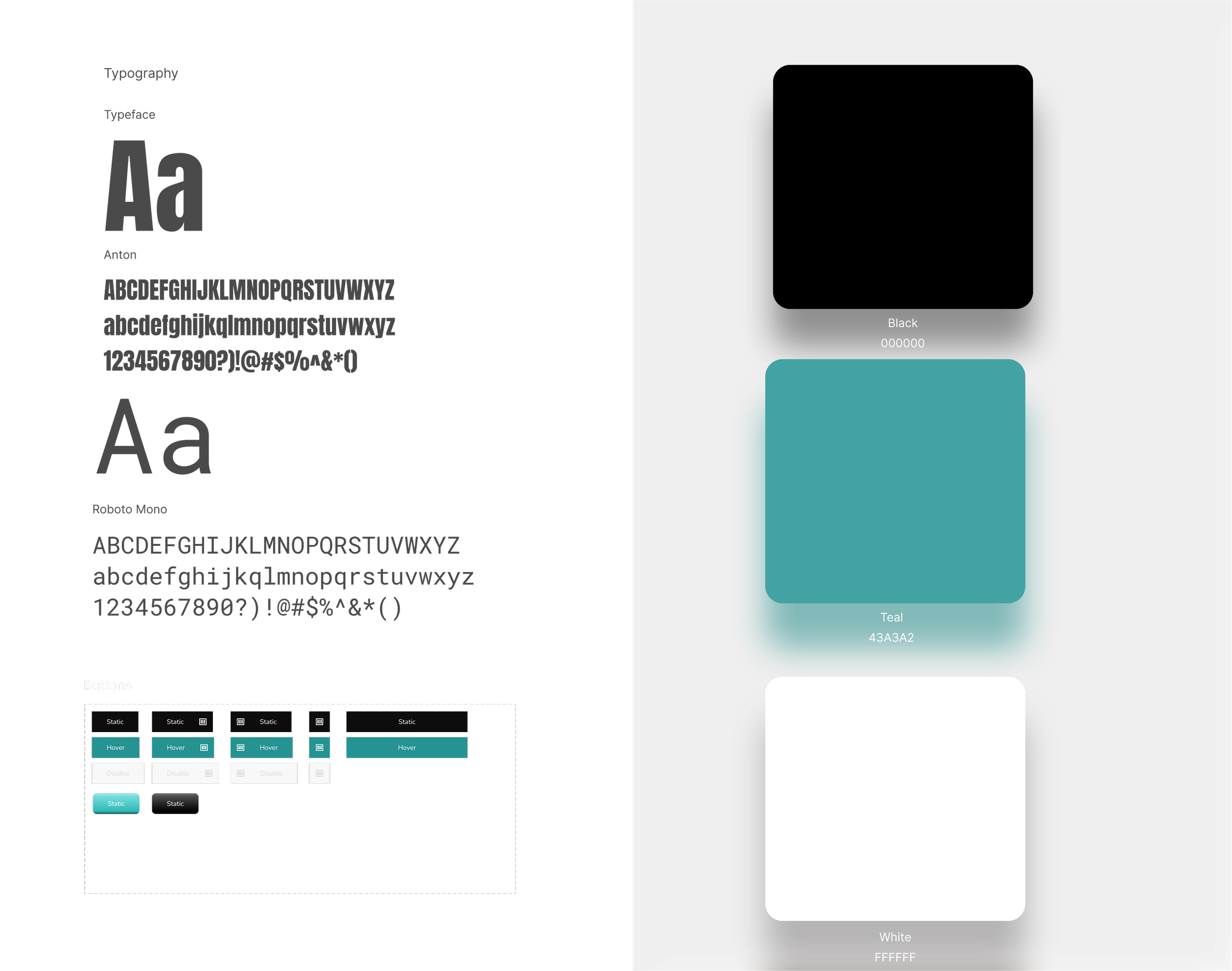
I helped solidify the color direction with the creative director and founder. To support the "luxury and minimalism" they wanted, I suggested one primary color plus black and white, keeping gradients minimal. I included gradient buttons as a compromise, so the team could visually compare options and settle on a direction.
Research
Stakeholder Kickoff & Key Insights, Mood Board, Information Architecture, Competitive Analysis
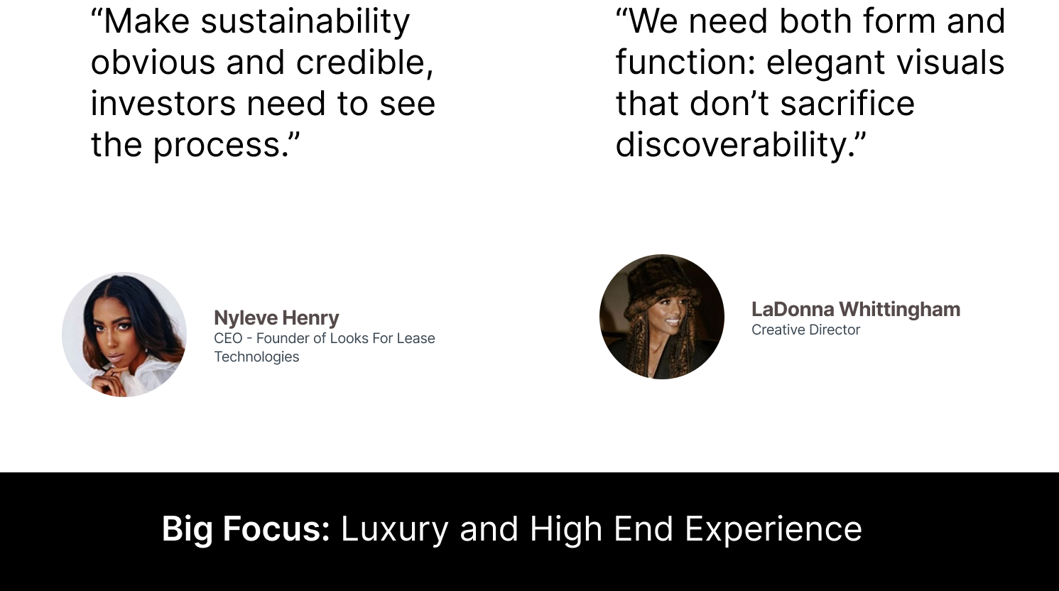
To begin the process, a meeting with the stakeholders that included the Founder and Creative Director was had to determine the needs and wants, as well as pinning down any challenges that needed to be addressed.
Stakeholder Kickoff
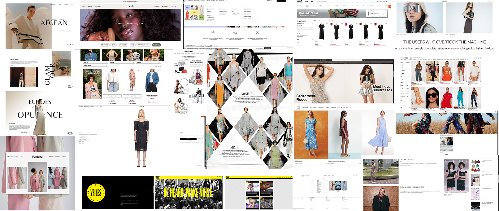
After the competitive analysis I brought my findings into another collaborative session. Being able to collaborate with the creative director helped in defining the main points the team wanted within the website as well as the iOS version of the application.
Mood Board
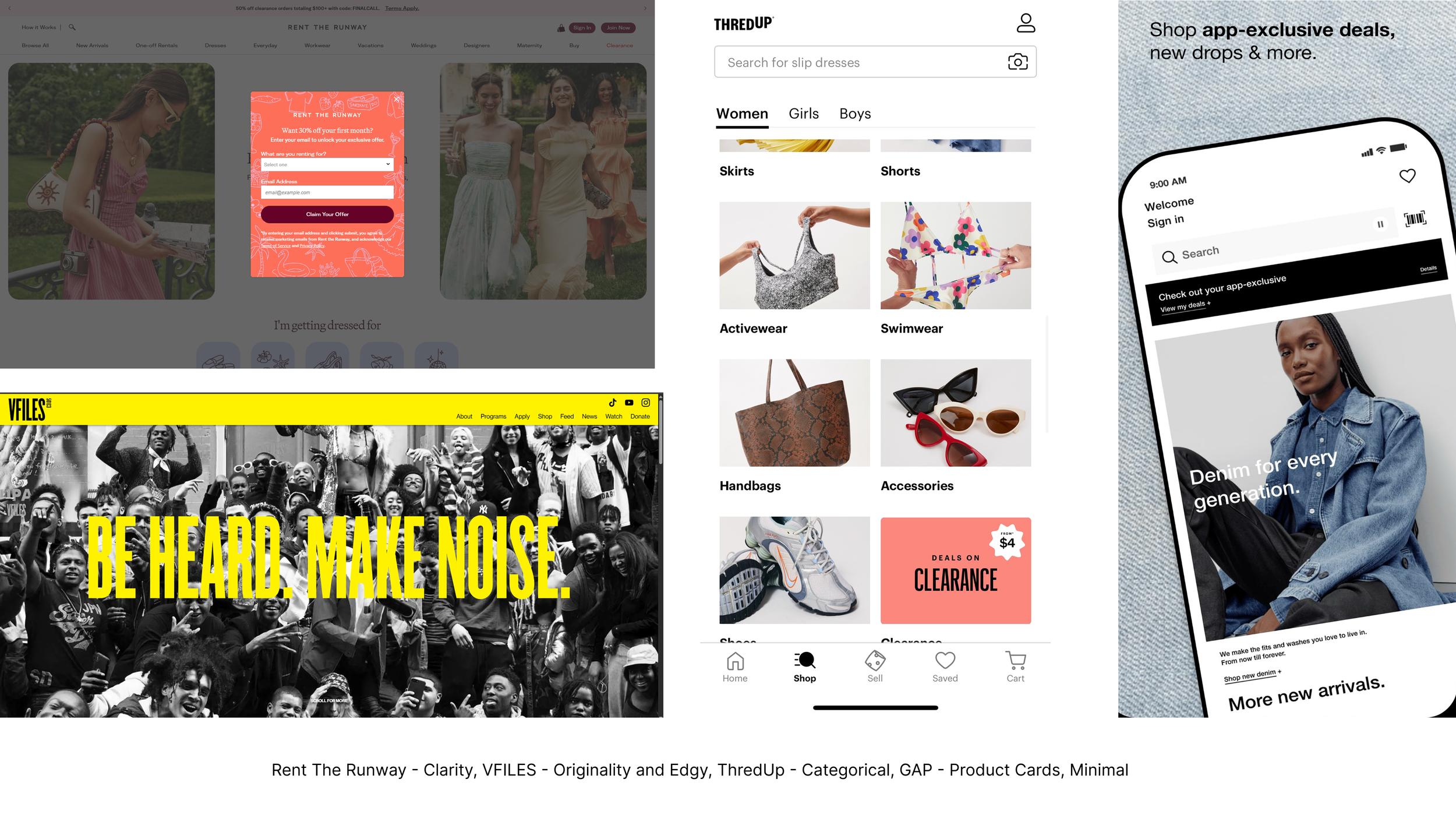
After the stakeholder kickoff, I researched competitors that reflected the specific aspects the stakeholders most wanted to address within the application. In speaking with the creative director and founder, originality also emerged as a priority, so balancing that with user familiarity became essential. This meant identifying the key elements that make an app both memorable and usable.
Competitive Analysis
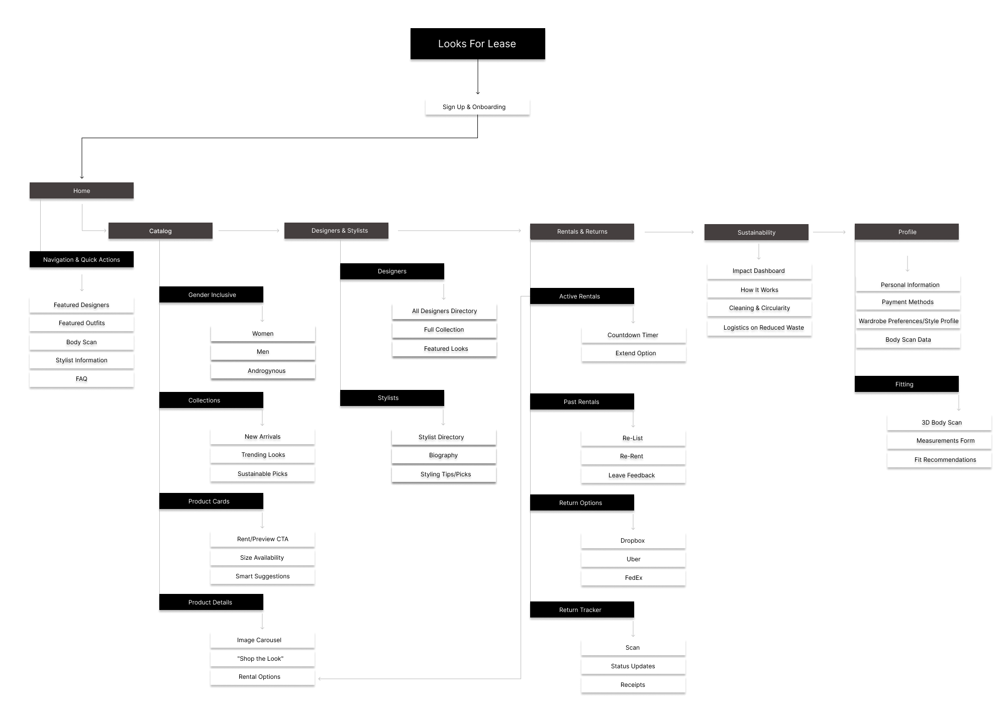
Information Architecture
Since this was a redesign, I mapped out architecture that could build on the founder's needs, including revisions midway through the 3-week timeline to incorporate new features. I also emphasized richer visual product information for the consumer, informed by the site's need for a stylist-curated look book, which would help increase product-to-consumer exposure.
Results & Reflections
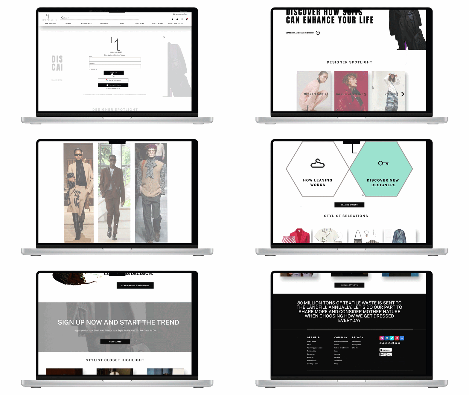
The outcome was a finalized layout that served as the roadmap for publishing the app, with key elements of the structure also applied to help finalize the website.
Outcome
Reflection
This project reinforced the value of designing with flexibility and intention, especially within tight time constraints and limited resources. Balancing the founder's vision for a luxury, minimalist experience with practical needs like accessibility, sustainability, and investor readability meant staying closely aligned with stakeholders throughout. Working independently within a three-week timeline also strengthened my ability to make quick, confident decisions. In the end, the information architecture became more than a planning document: it served as the roadmap used to publish the app, with portions of the structure also applied to finalize the website.