
Upper & Lowercase
Magazine
Academic
Role: Graphic Designer
Tools: Illustrator, InDesign, Photoshop
Timeline: 8 Weeks
Project Brief:
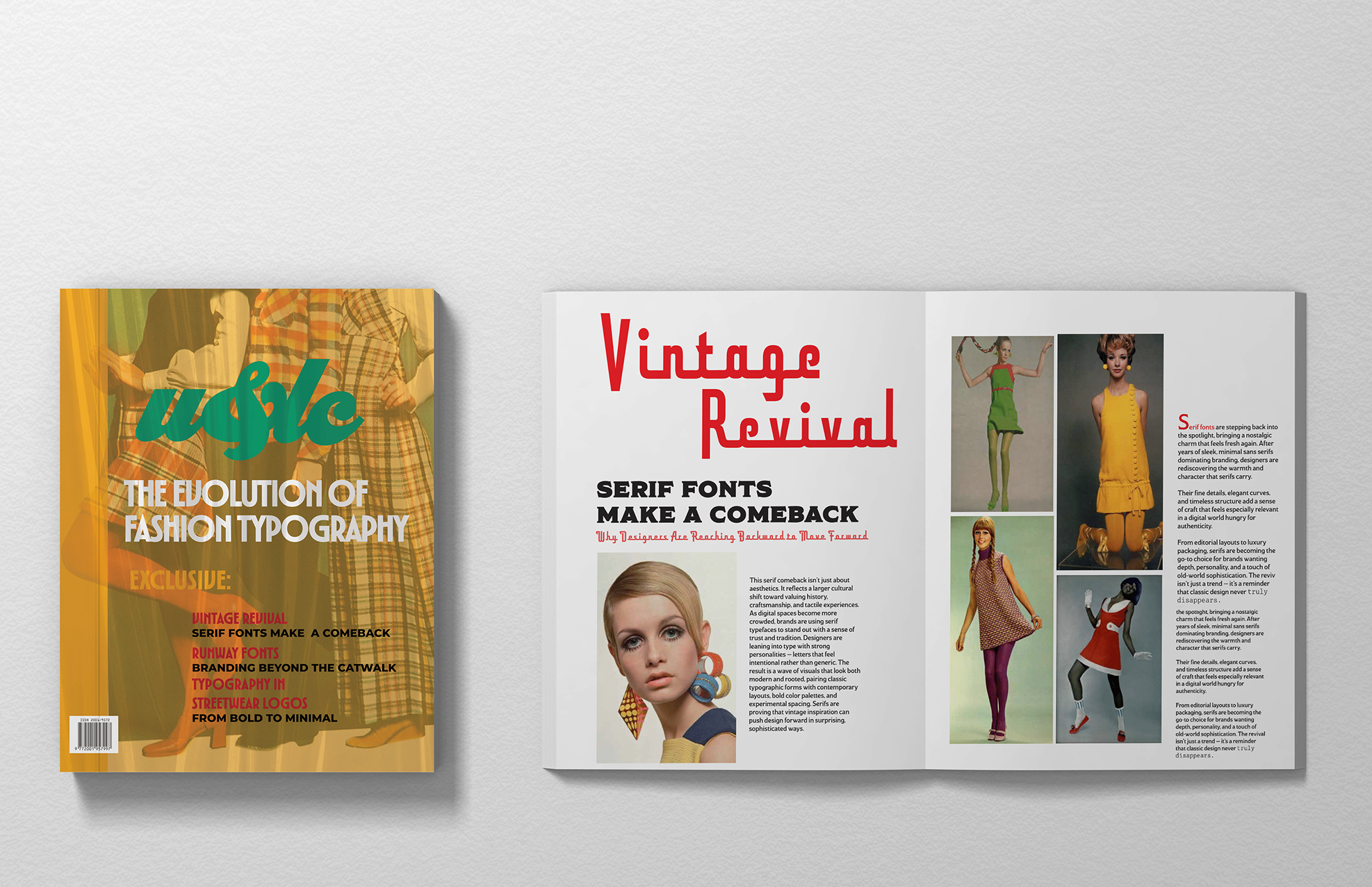
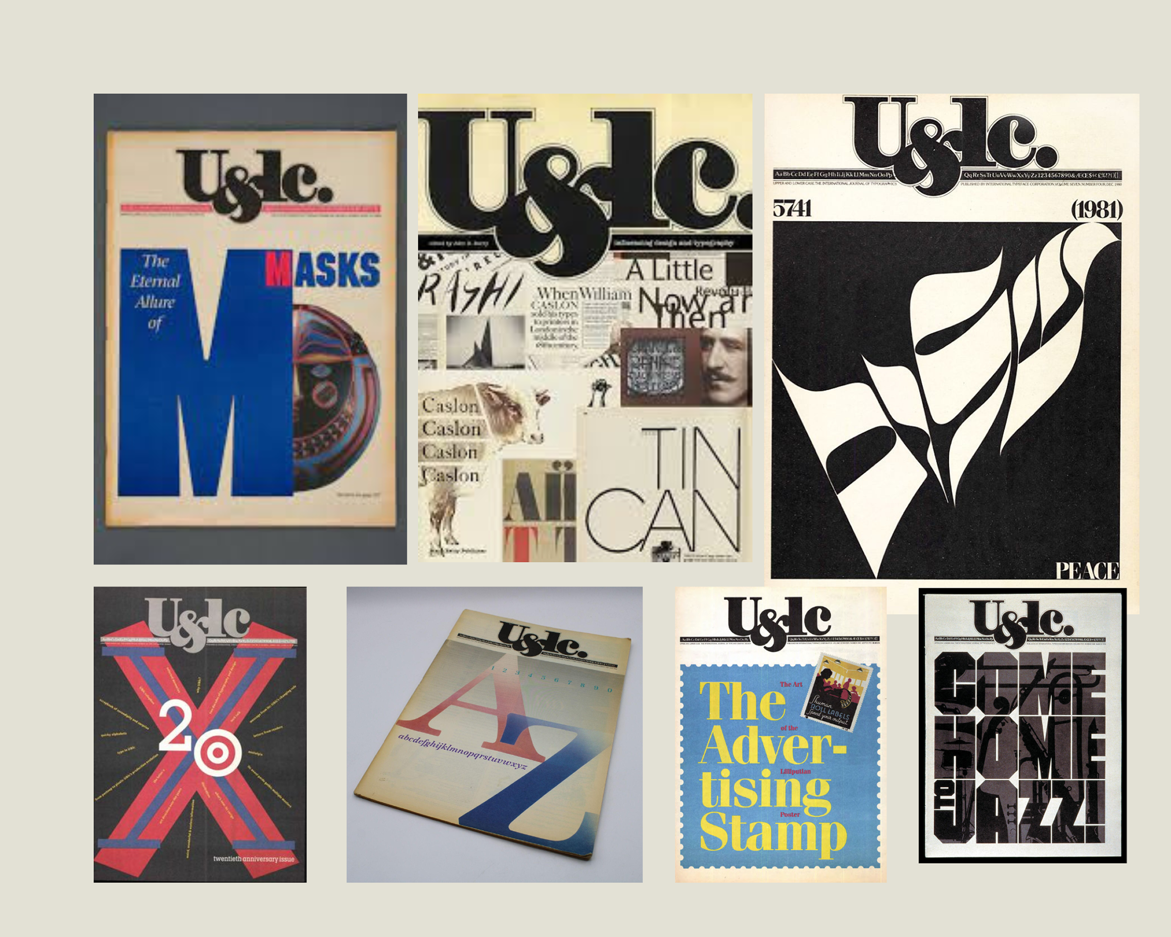
This project reimagines U&lc (Upper & Lower Case), the iconic typographic magazine originally published by the International Typeface Corporation, as a contemporary print publication for today's design landscape. The original broadsheet format served as a playground for experimental typography and design culture throughout the 1970s and 90s.
This redesign preserves that editorial spirit while rebuilding the publication's visual identity from scratch.
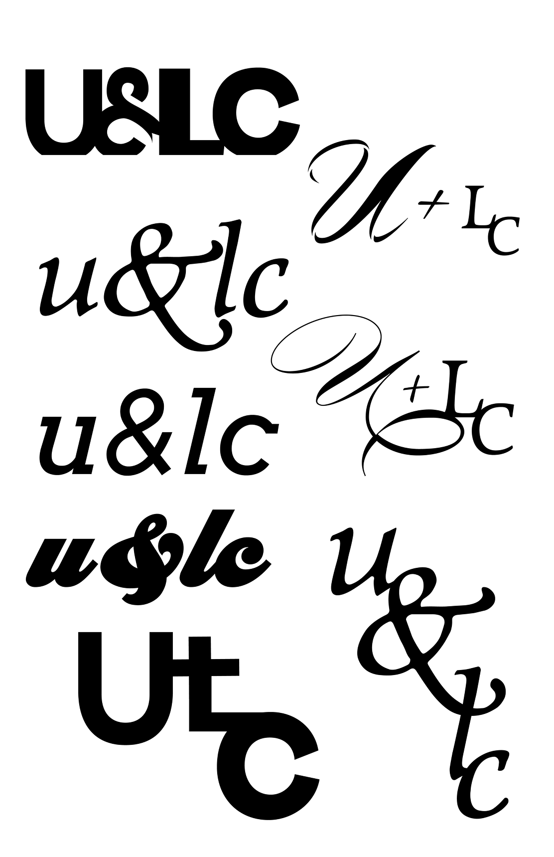
Text Exploration
Moodboard
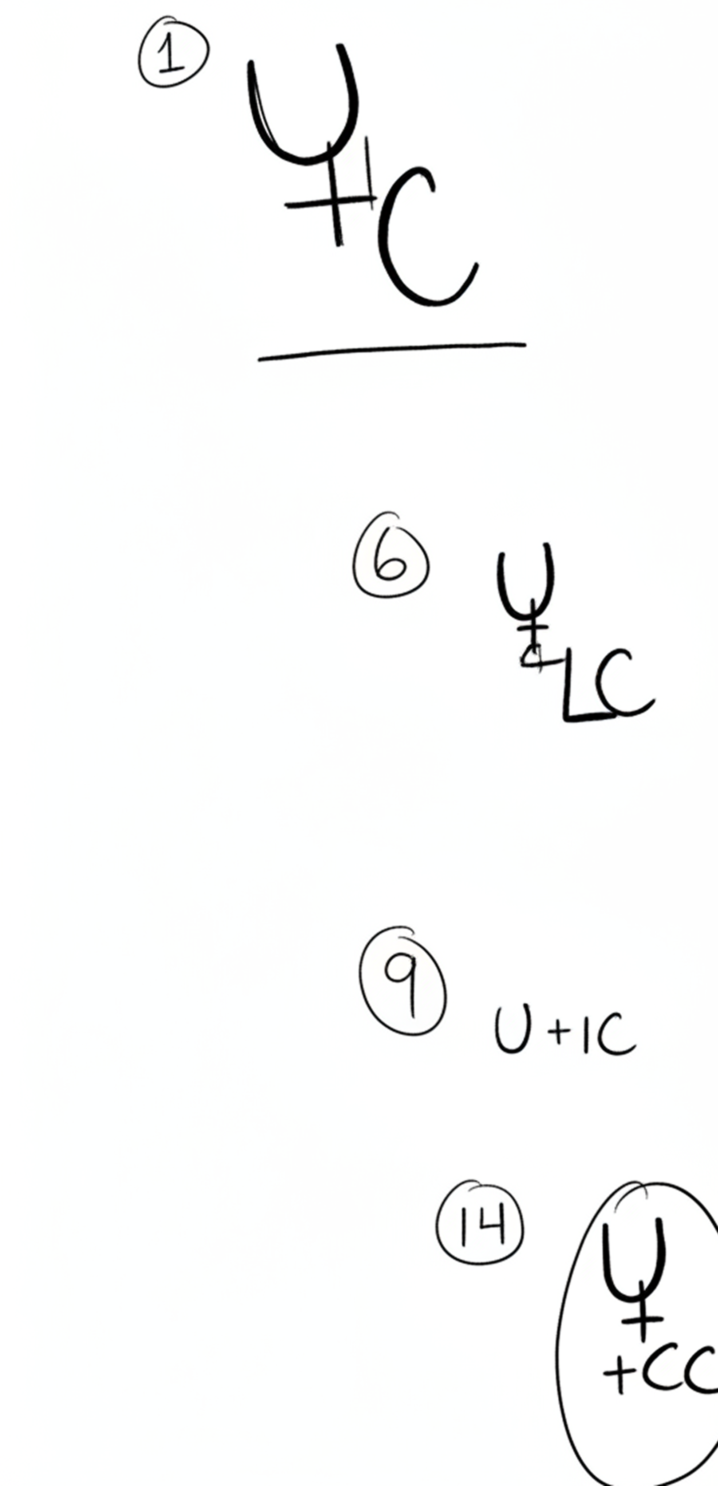
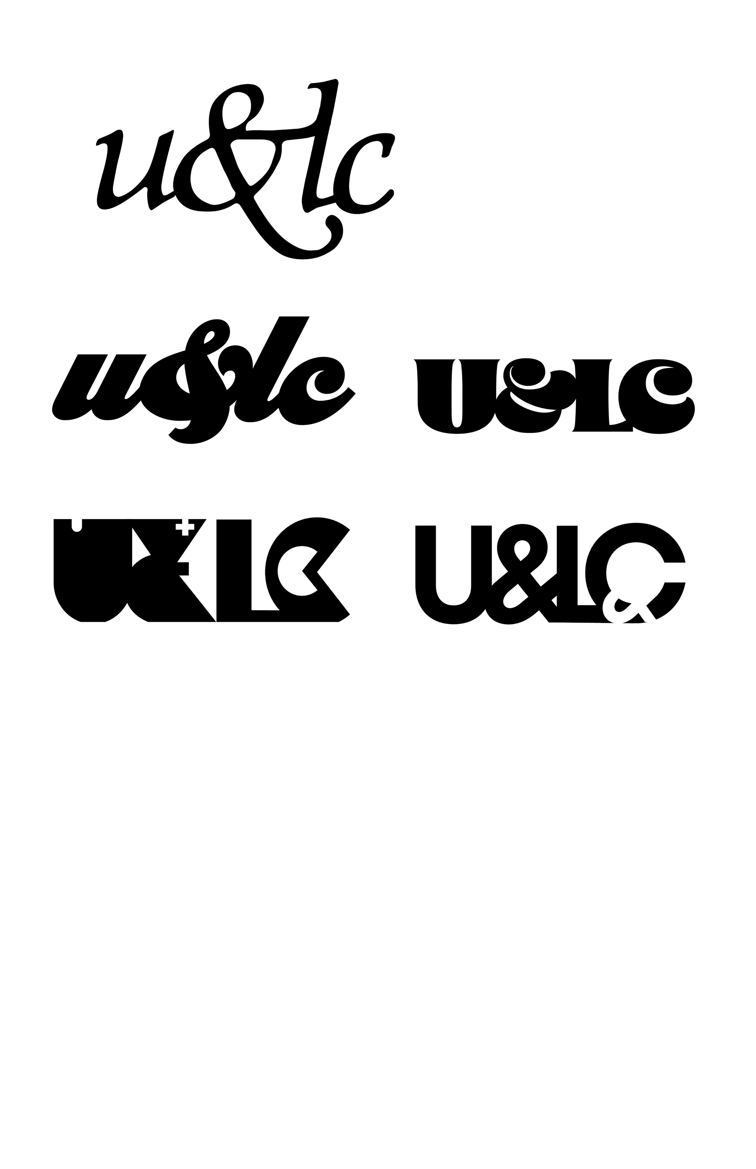
Logo Compositions
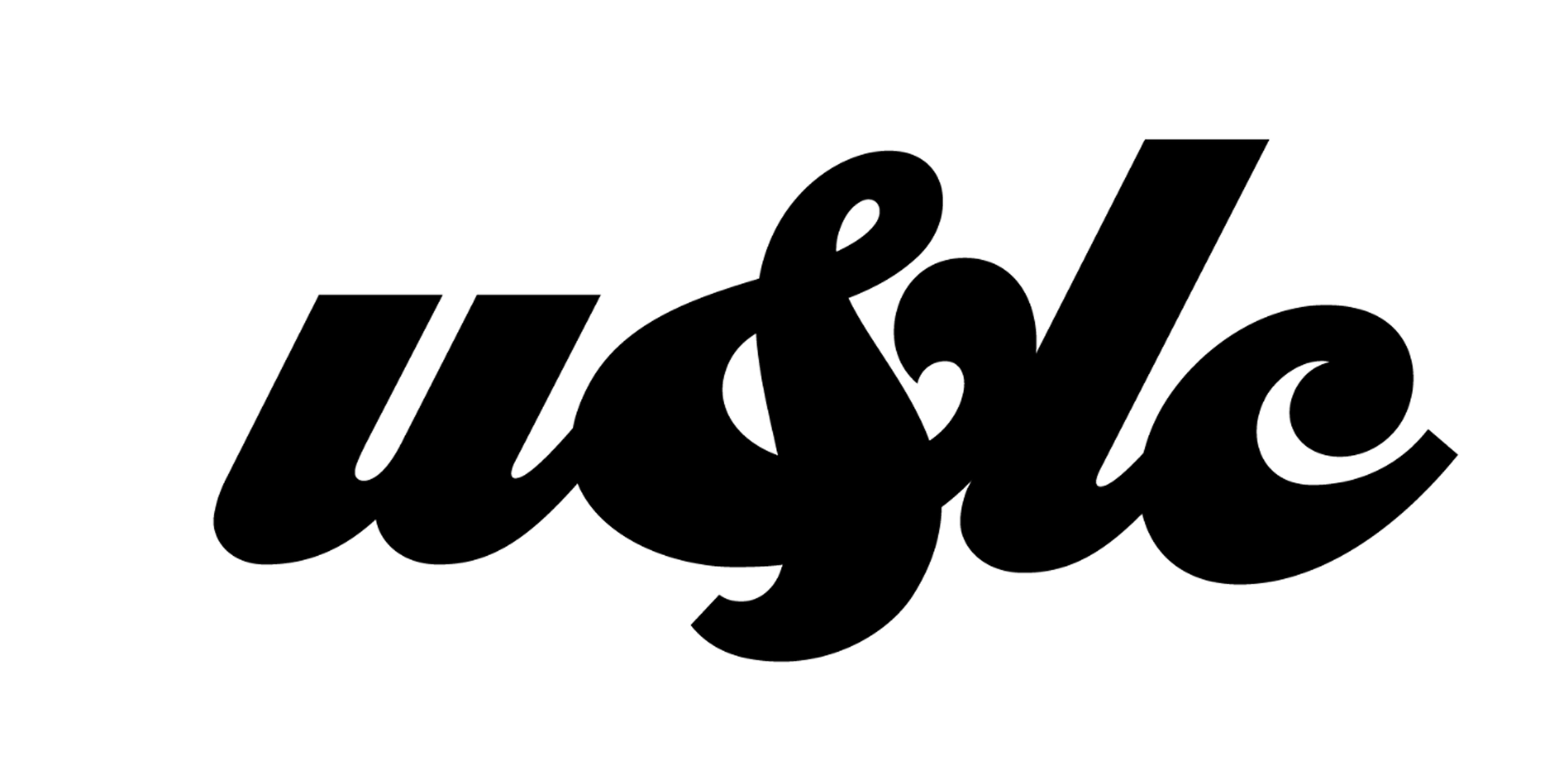
Final Logo
Magazine Layout Compositions
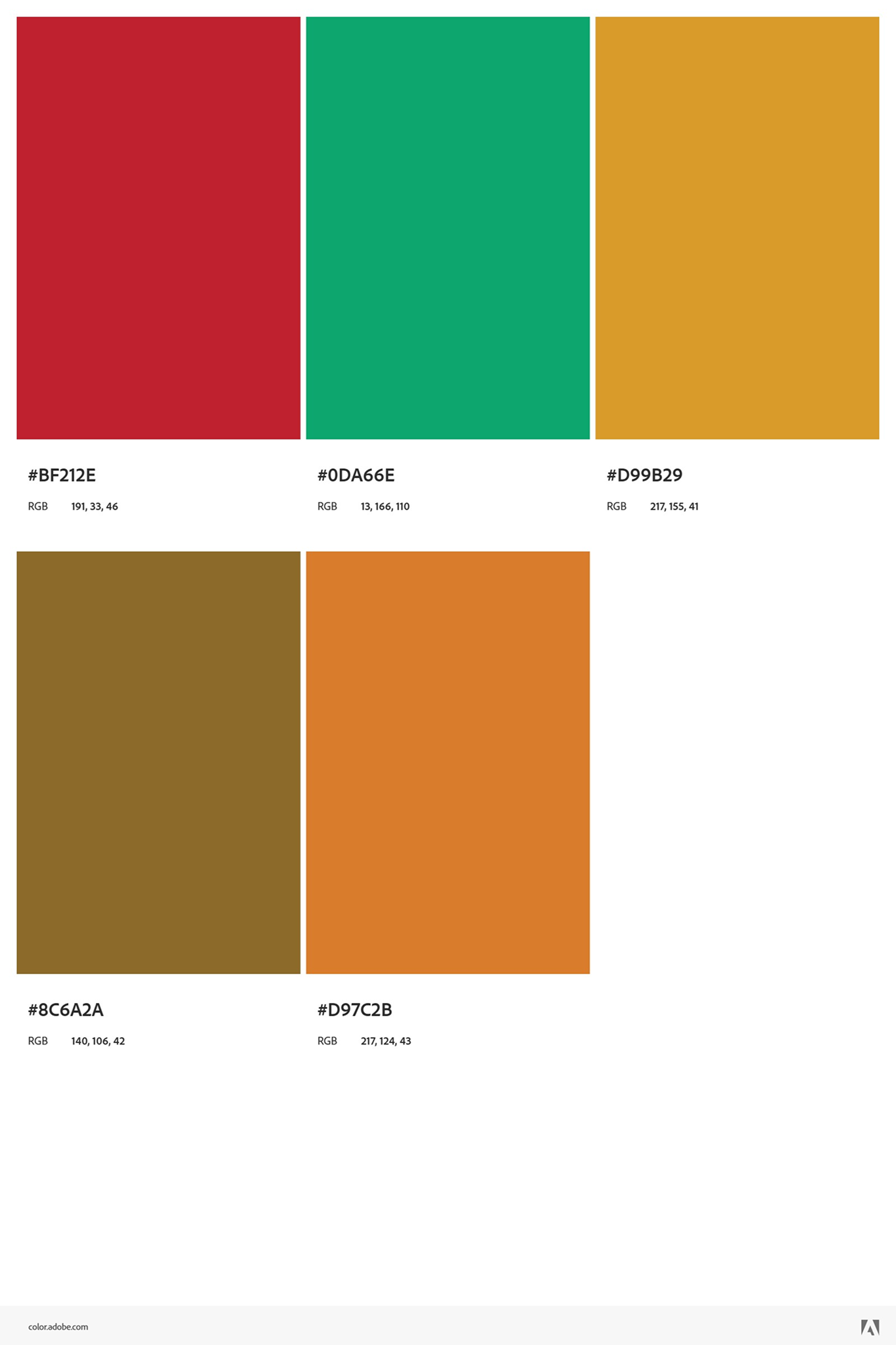
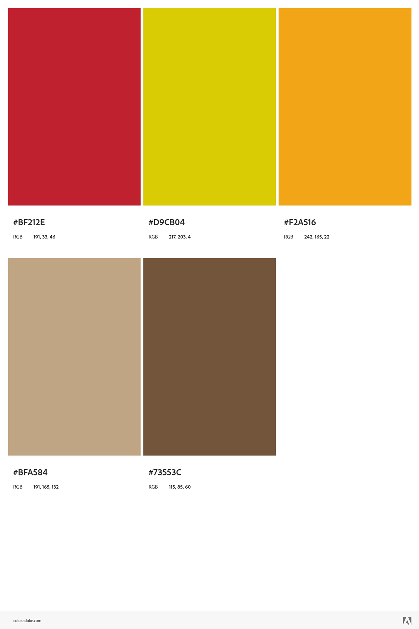
Color Palette
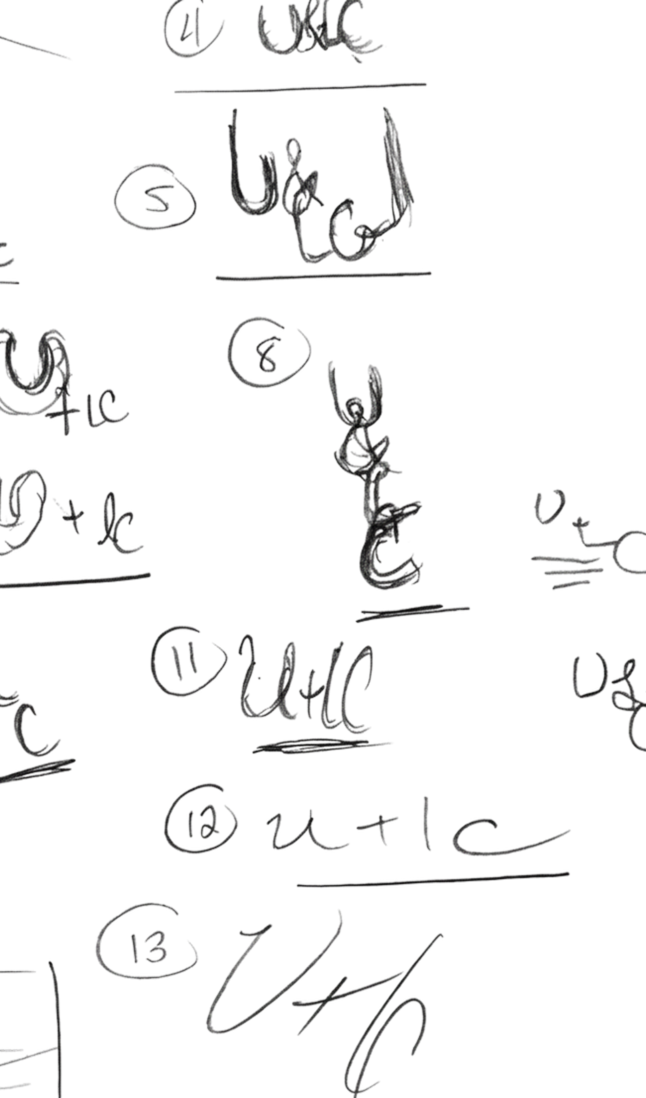
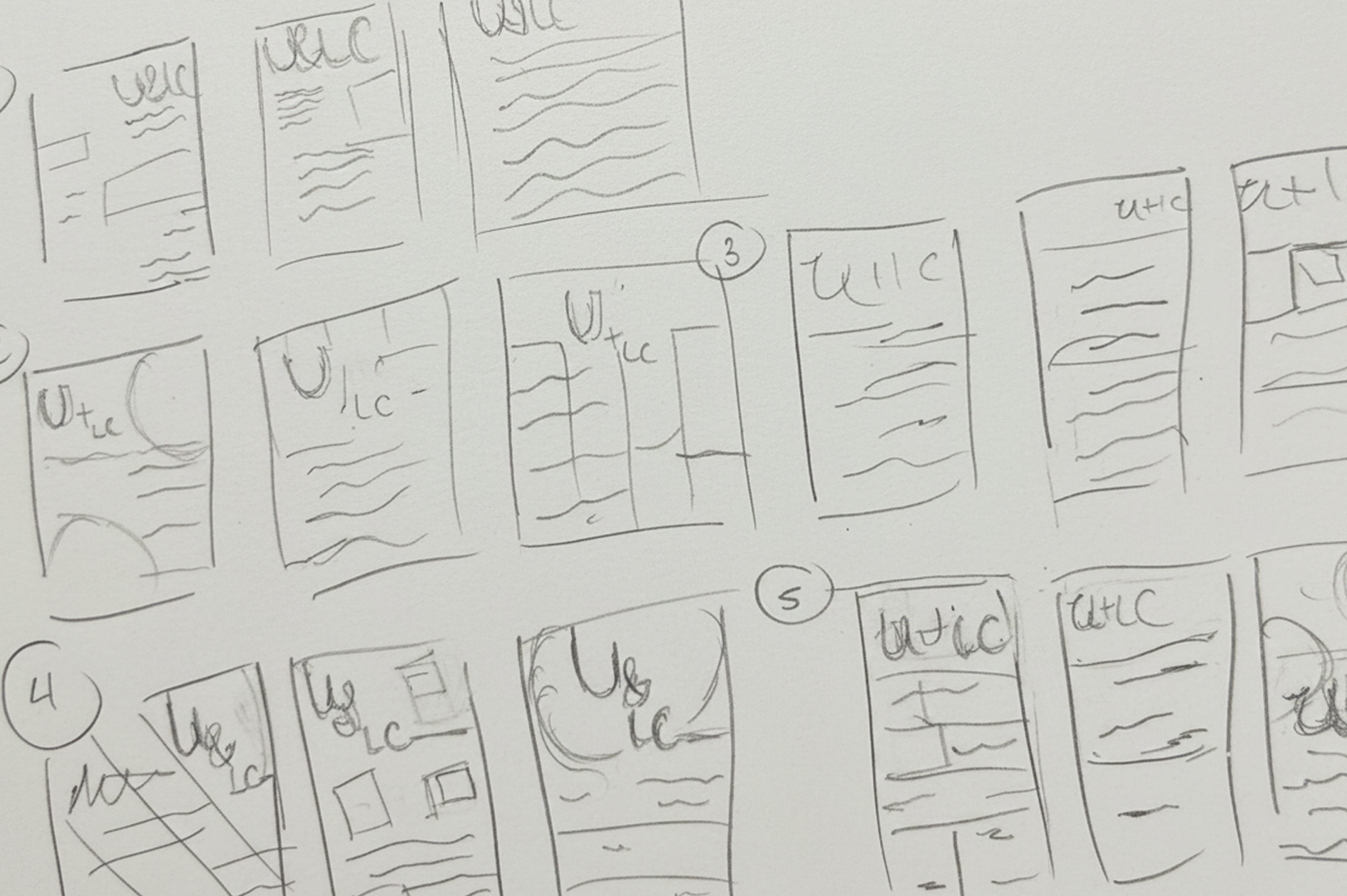
Sketches
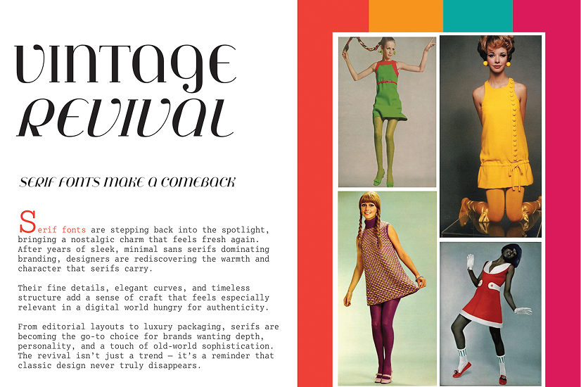
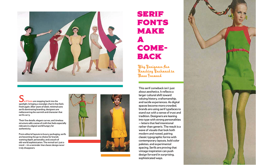
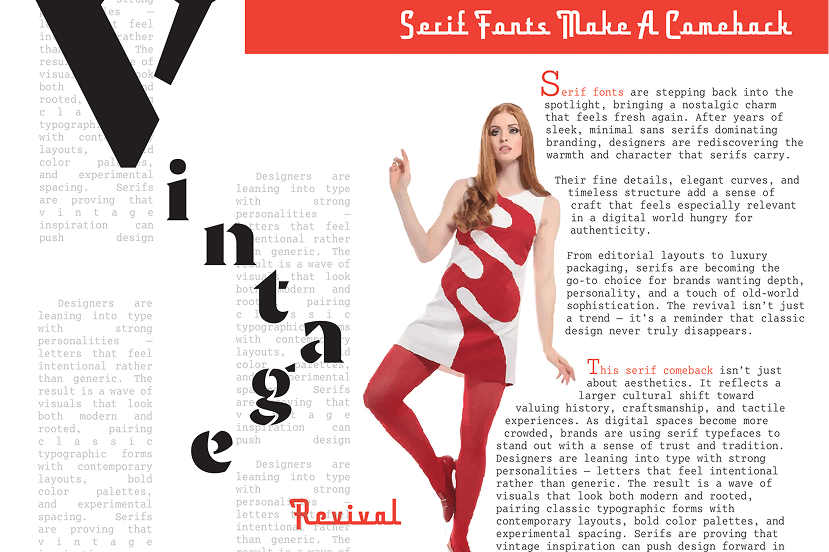
Sketching out potential magazine layouts was vital to the progress I made in terms of different versions. Each sketch had images placed in different sections but the main goal was to be able to make the magazine dynamic compared to just static for the fashion vibe I wanted it to show despite it being a vintage theme eventually.
Digital
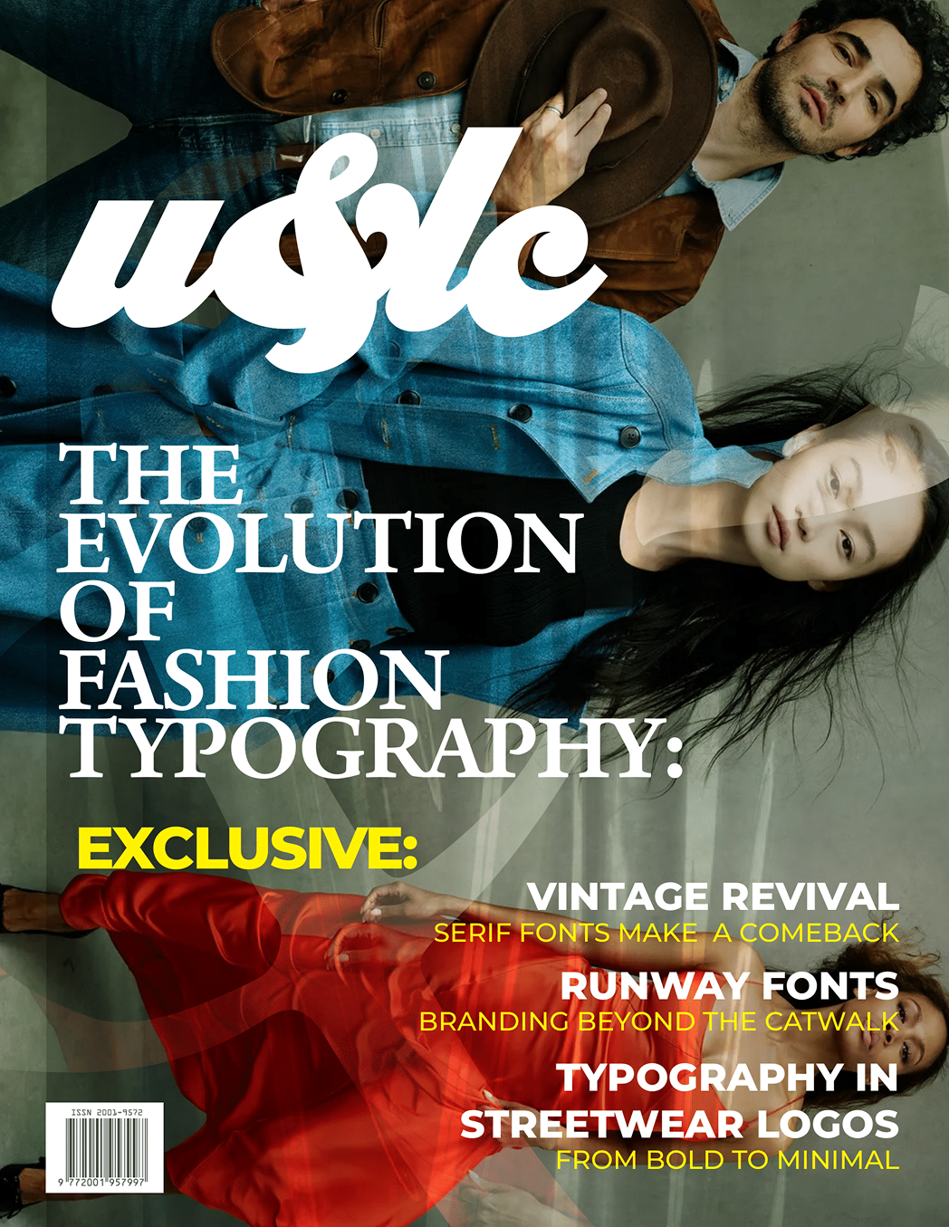
Cover Iterations
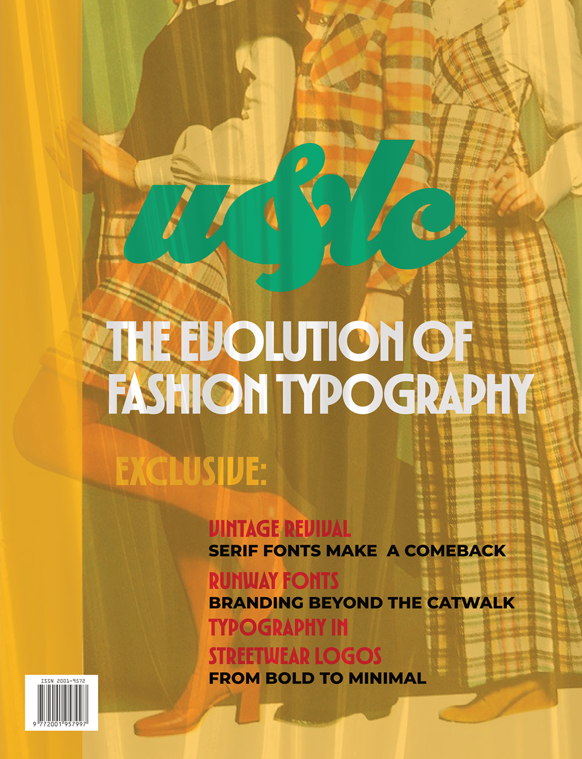
Cover Final
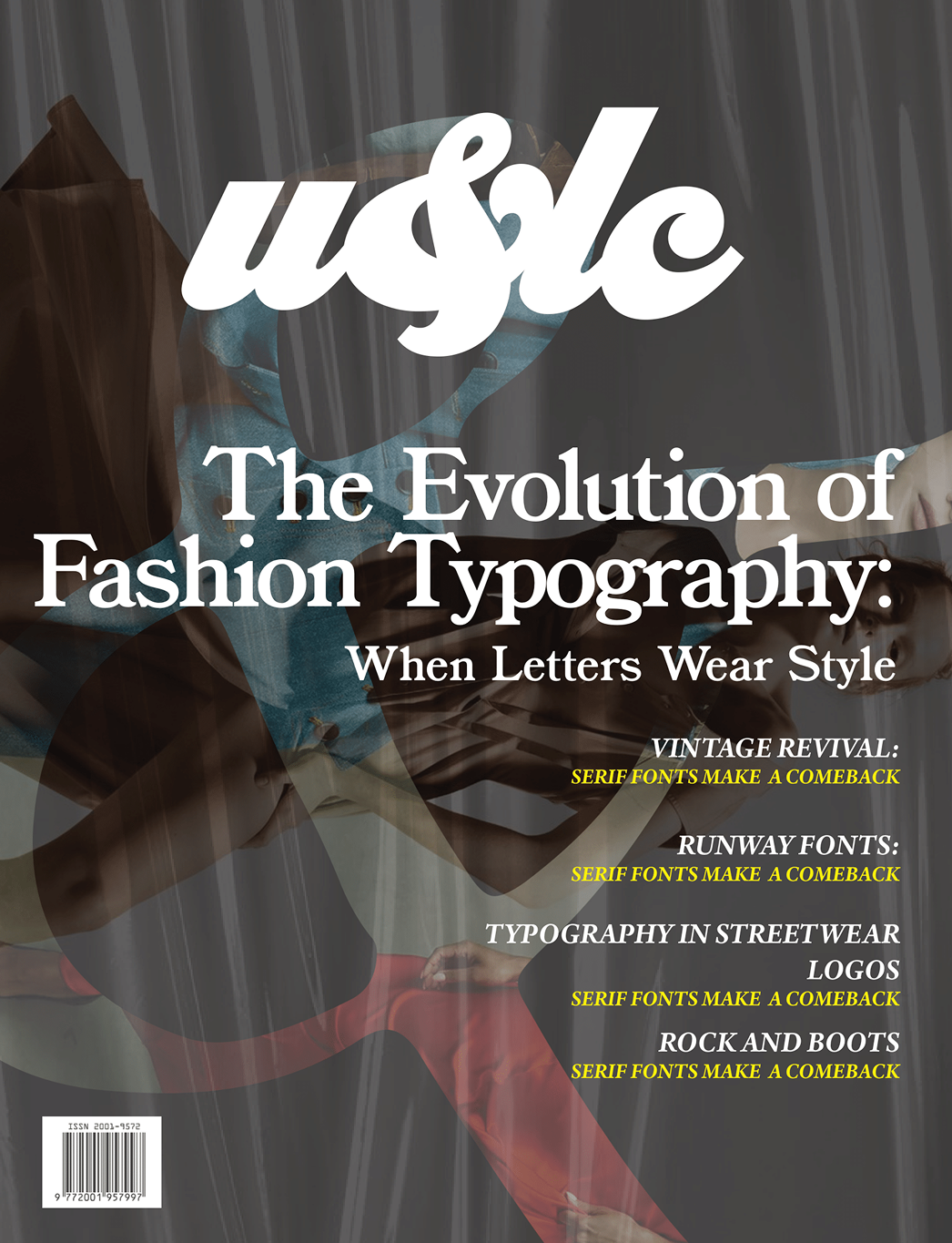
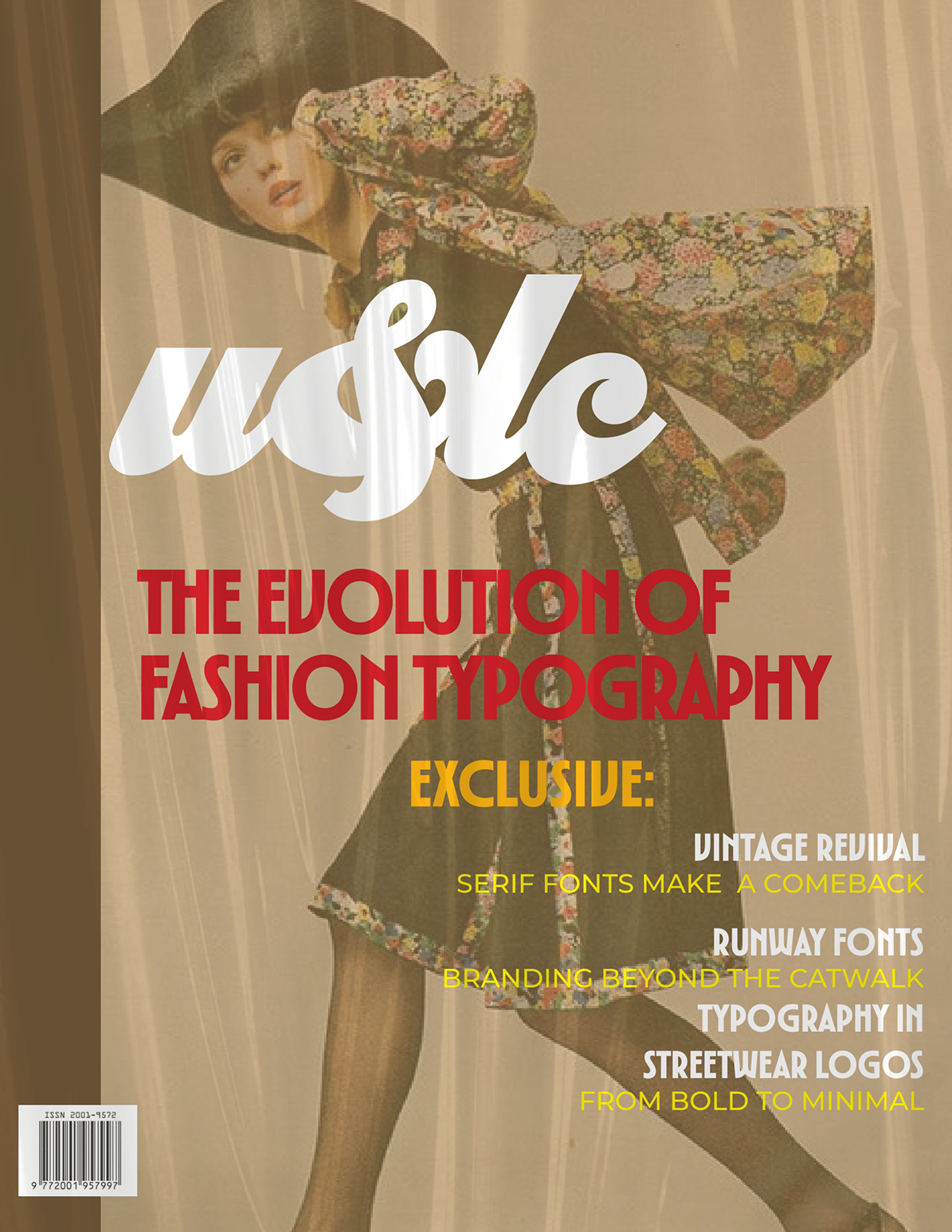
Spread Iterations
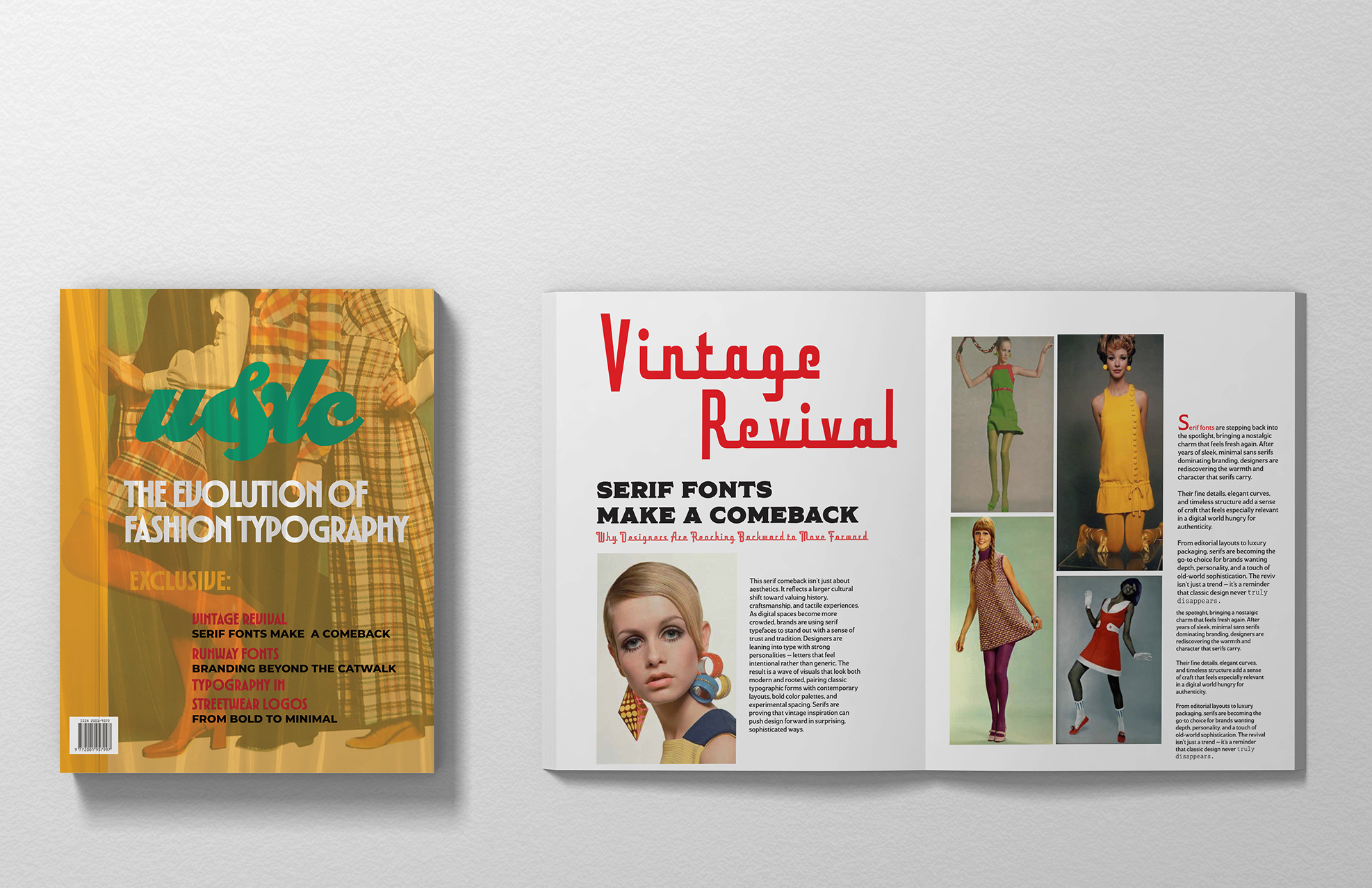
Spread Final
Reflection
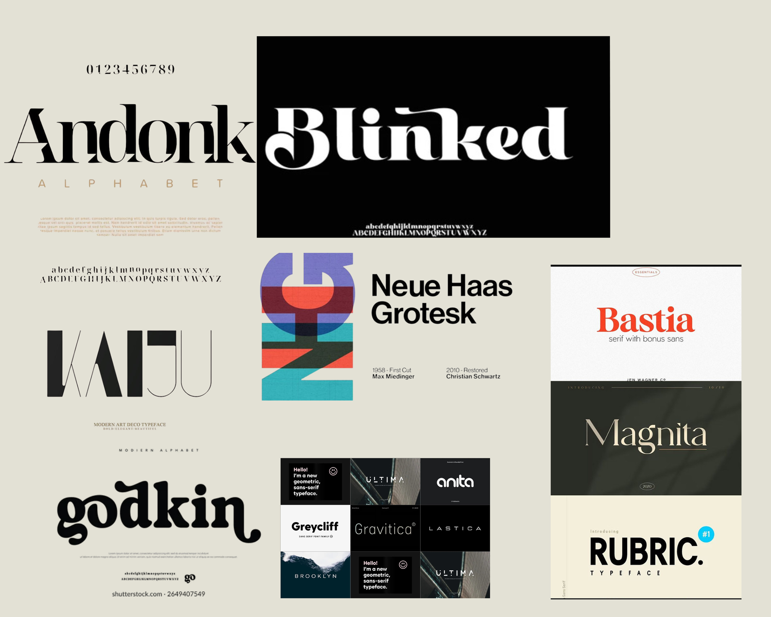
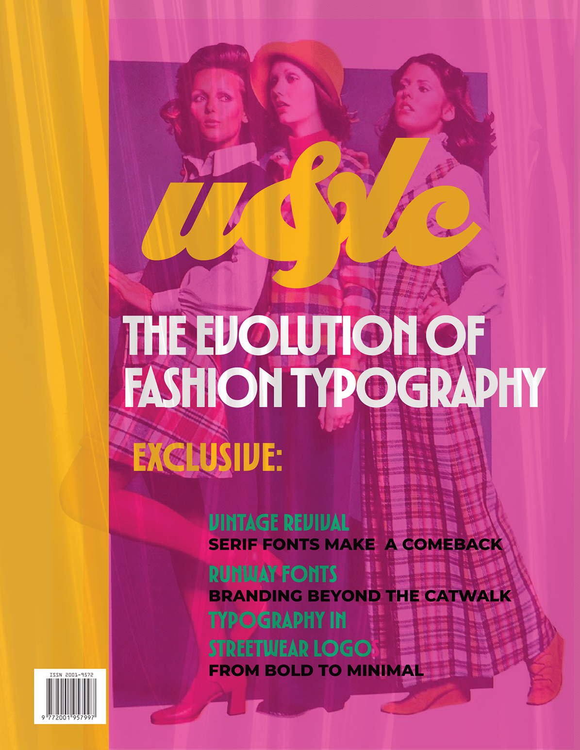
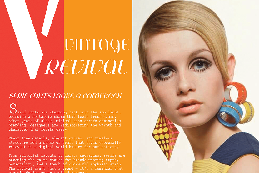
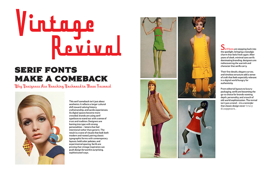
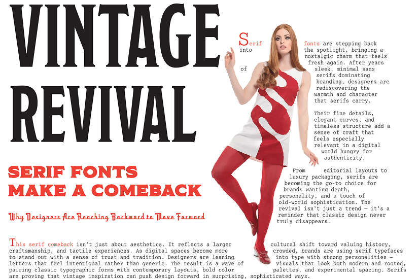
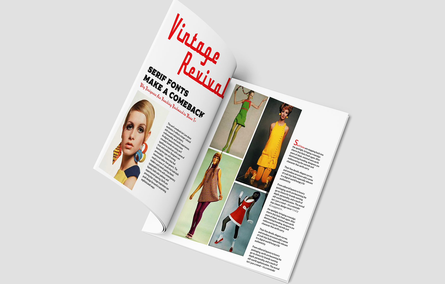
For this project, I focused on a fashion-inspired vintage font revival, drawing on the return of expressive serif typography. Some of my early sketches and cover ideas didn’t successfully convey that theme they felt off-tone or too modern. As I developed the spreads, however, they naturally aligned much better with the vintage aesthetic and became the strongest part of the project.
Because of this as well as the feedback I thankfully received continuously through the process, I was able to redesign the cover to match the style of the spreads, ensuring the entire magazine felt cohesive. This process taught me the value of flexibility being willing to adjust the direction and refine concepts when certain ideas don’t work. In the end, the final designs better communicate the theme and work together as a unified system.