
Design In Motion:
Bringing The C Spot LA’s Energy Online
The C Spot LA is a vibrant, creative movement studio rooted in dance, wellness, and community. While their brand and digital presence laid a solid foundation, there was a clear opportunity to better capture the studio’s unique energy, personality, and inclusive spirit online.
Academic | Industry ProjectRole
Scope
March - June 2025
Tools
FigJam, Squarespace, Figma
Digital Co-Lead - Website
Individual Problem Statement
Team Problem Statement
What will be needed to design a digital identity that captures the fluid, expressive spirit of The C Spot LA and relay that sentiment to an online presence that promotes their community to help with growth and exposure?
How might we design a digital identity that captures the fluid, expressive spirit of The C Spot LA and improves accessibility and engagement for their community?
Solution
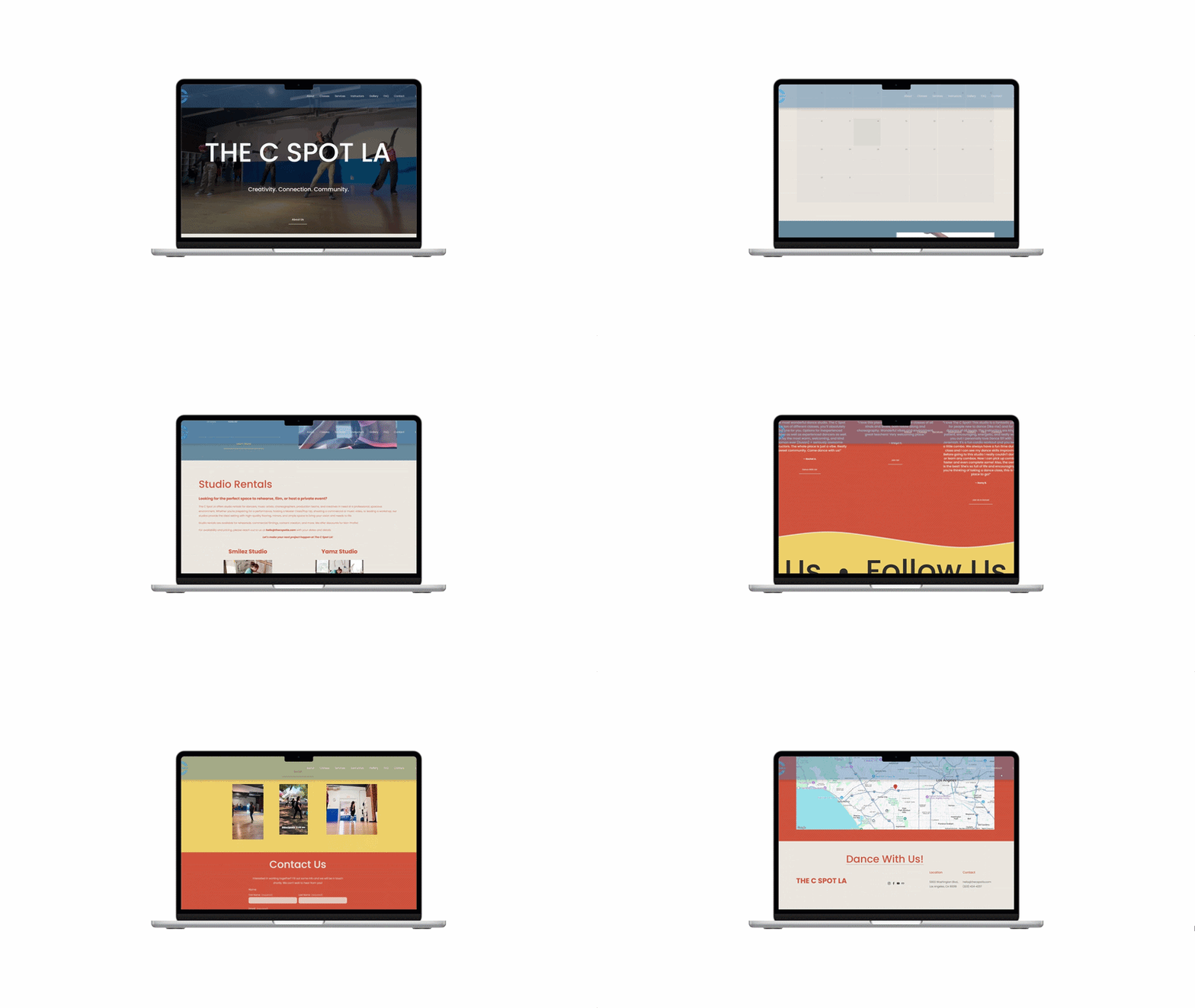
Incorporate movement and vibrant colors as well as add new structures of organization to the site to have ease of access for booking classes. In a way the website would keep its vibrance, express itself through a more flowy experience, and have more modernity to connect with younger audiences.
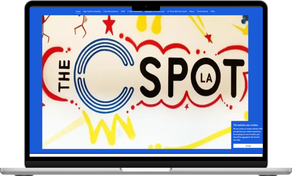
Before
The C Spot LA Website Homepage
After
The C Spot LA Redesigned Website Homepage
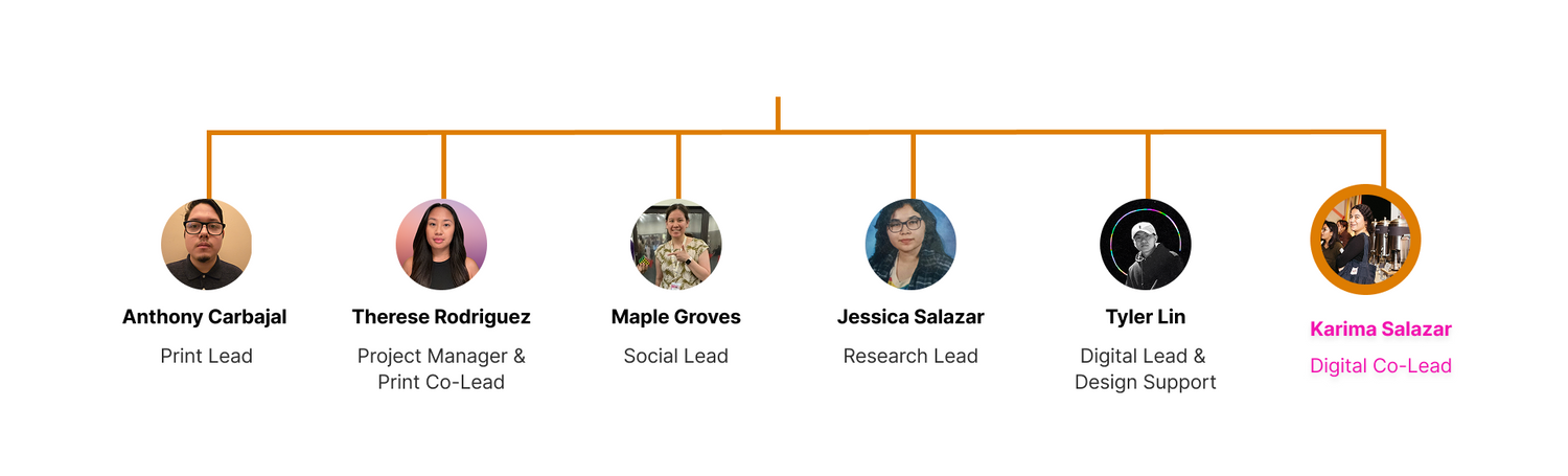
The Team
My Role
As Digital Co-Lead, I was responsible for revamping the client’s website at the same time as transferring their current material onto a new platform (Squarespace). Being on the branding team meant developing refreshed visual identity assets and templates, & I translated those into a digital experience.
Designs & Features
When The C Spot LA gave us their target audience, which was members of the community around, both younger and older but mainly younger, it gave us an idea on how to add a few website enhancements that felt a bit more modern and provided ease of access to anyone visiting the site.
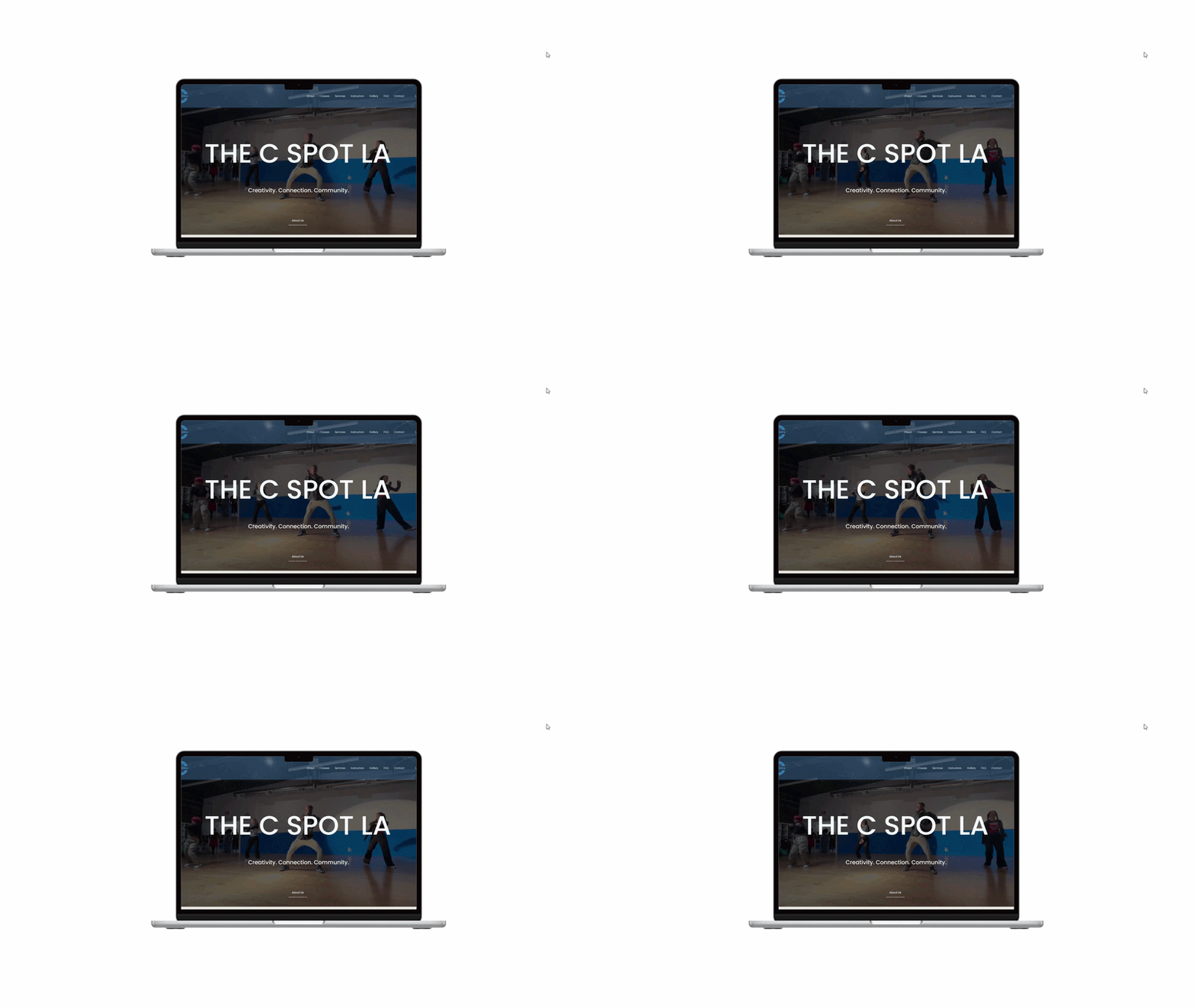
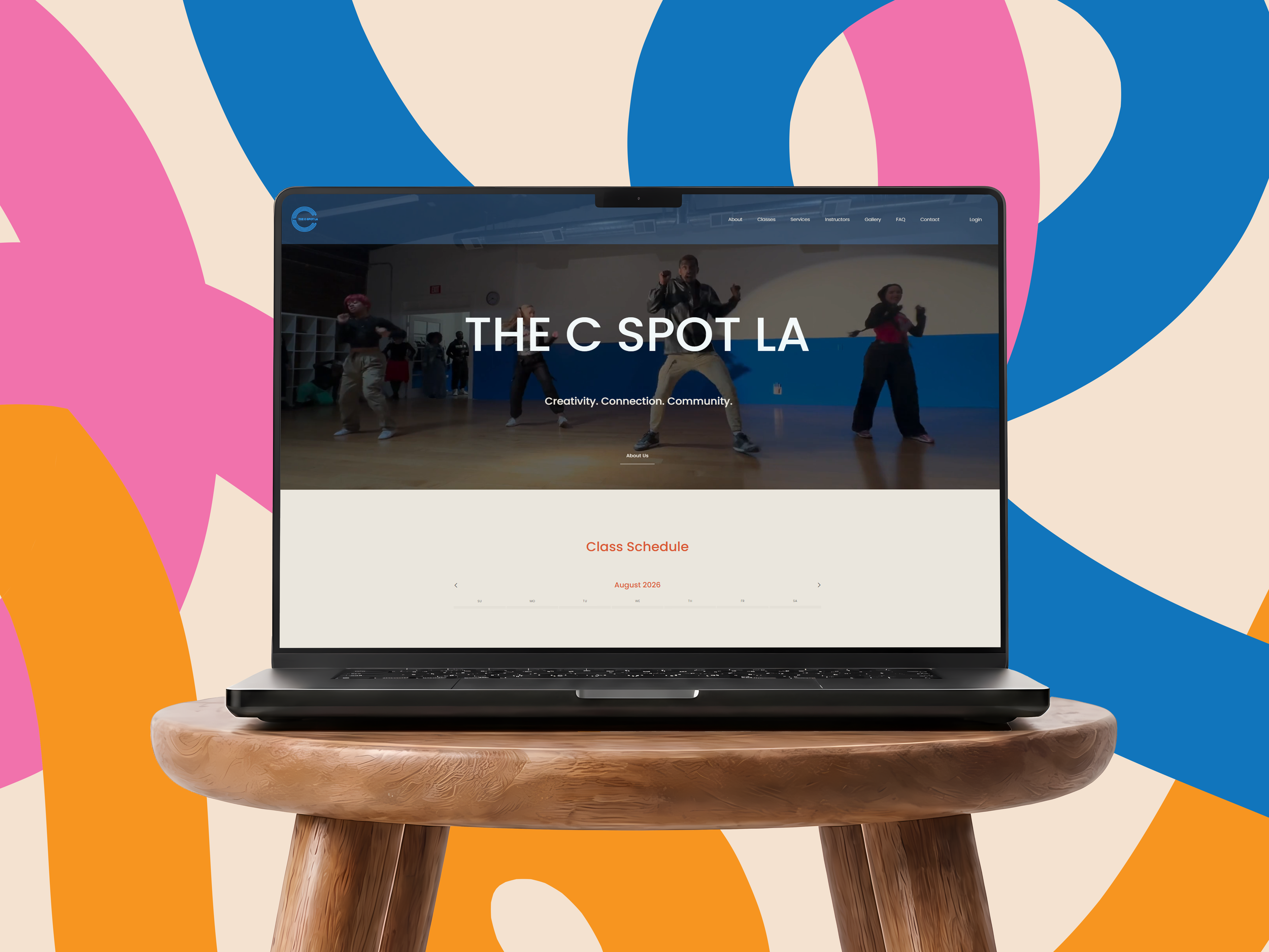
Dynamic Homepage
The C Spot LA is a dance studio, and it was vital for them to show it as soon as the user clicked on their website.
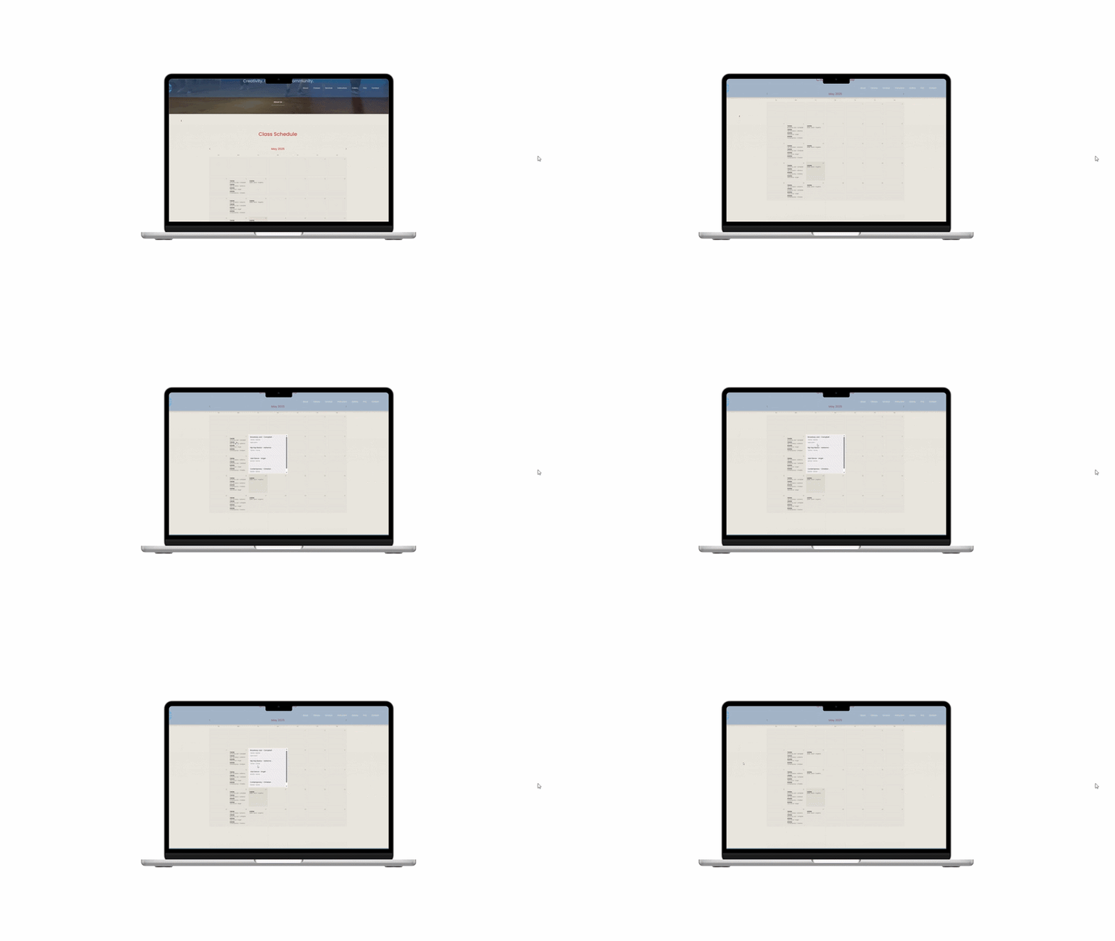
The C Spot LA Redesigned Website Class Schedule
Class Schedule
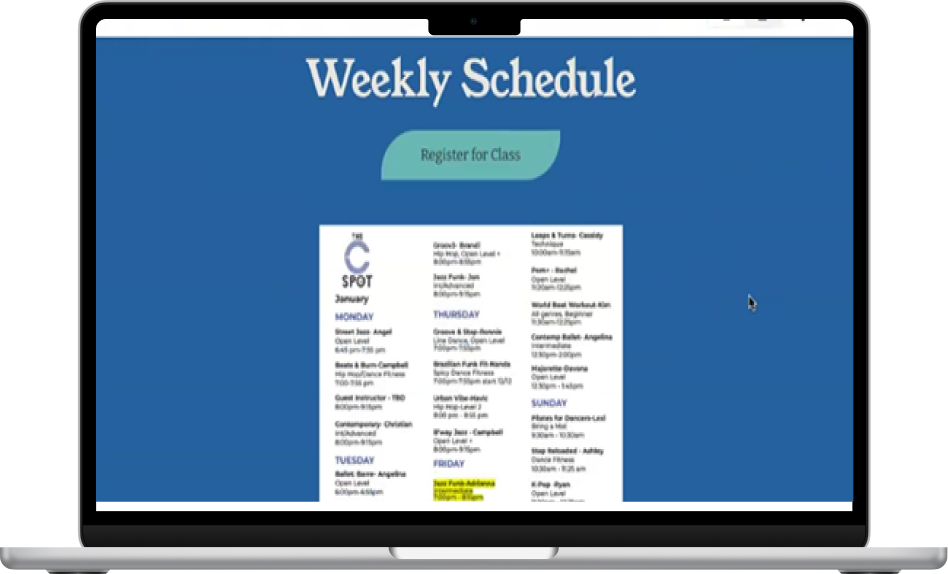
The previous calendar was a PDF file, so to add a bit more ease of use, a calendar with the classes for each day were provided to enhance the experience in finding a future class to attend.
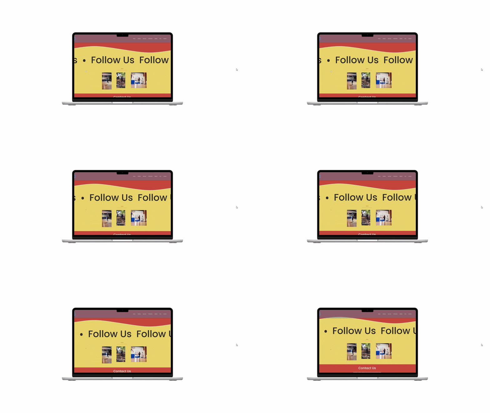
Socials CTA
The C Spot LA wanted to promote their socials via website, so a fun way to view their content and a button that lead to their Instagram page was created.
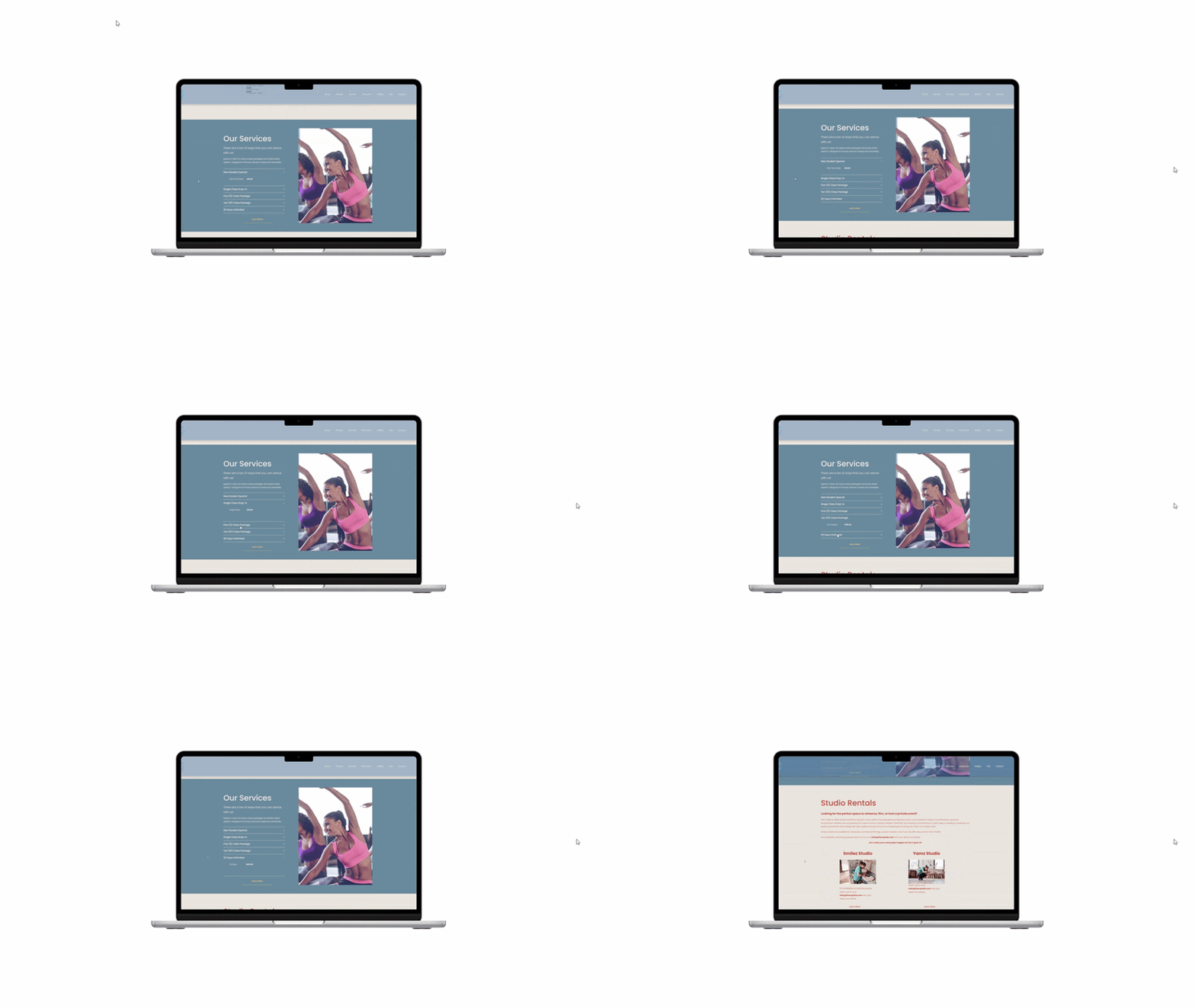
Services Panel
There was a need for the tiers of dance class costs to be included and visible to anyone to book, as well as a need for the studio to show that their studio was available for rent.
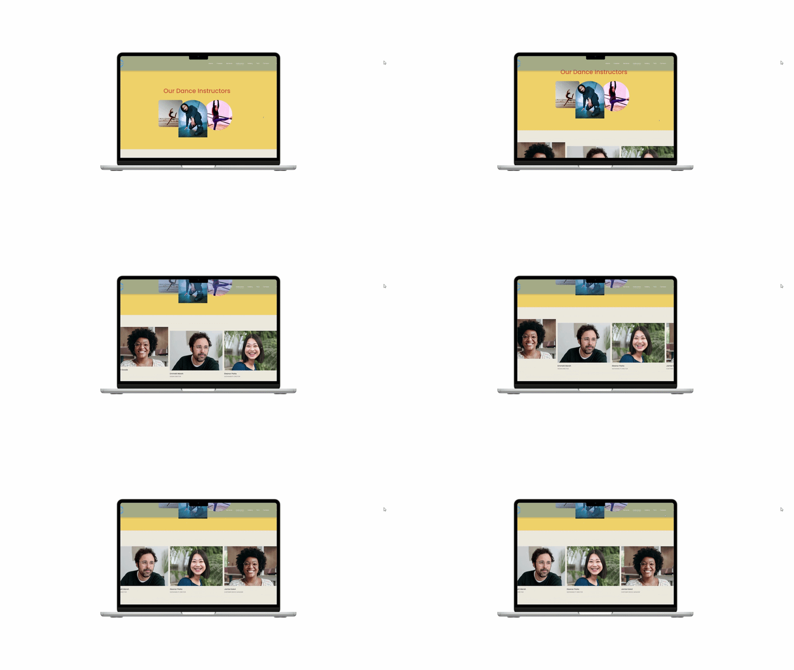
The C Spot LA Redesigned Instructor Page
Instructor Page
An important addition was the dance instructor page. The previous version of the page was a pdf with the biography included under the instructor’s name, and so we suggested adding sections where each dance instructor profile was clickable for an easier navigation.
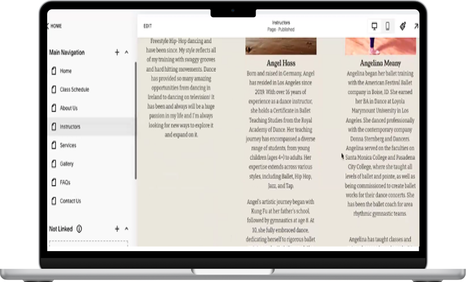
The C Spot LA Previous Instructor Page
Research
As part of the branding team, we had to use methods such as informed design and competitive analysis to fully bring to life The C Spot LA’s brand.
Stakeholder Kickoff
Beginning with the stakeholder kickoff we were able to determine what were the main needs and constraints.
Our core findings were that users being able to find the classes was one of the main needs. Constraints included being cost efficient as well as being able to find a color scheme that was primary and also bright.
Heuristic Evaluation
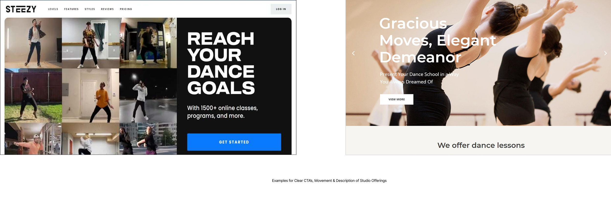
While the rest of the team was determining the parts of design that included the color palette & logo creation, I first looked at The C Spot LA’s current website to find any improvements that could be made through a heuristic evaluation. Through this I was able to determine other needs, as well as take note of user navigation complications that could be fixed along the way.
Research Synthesis
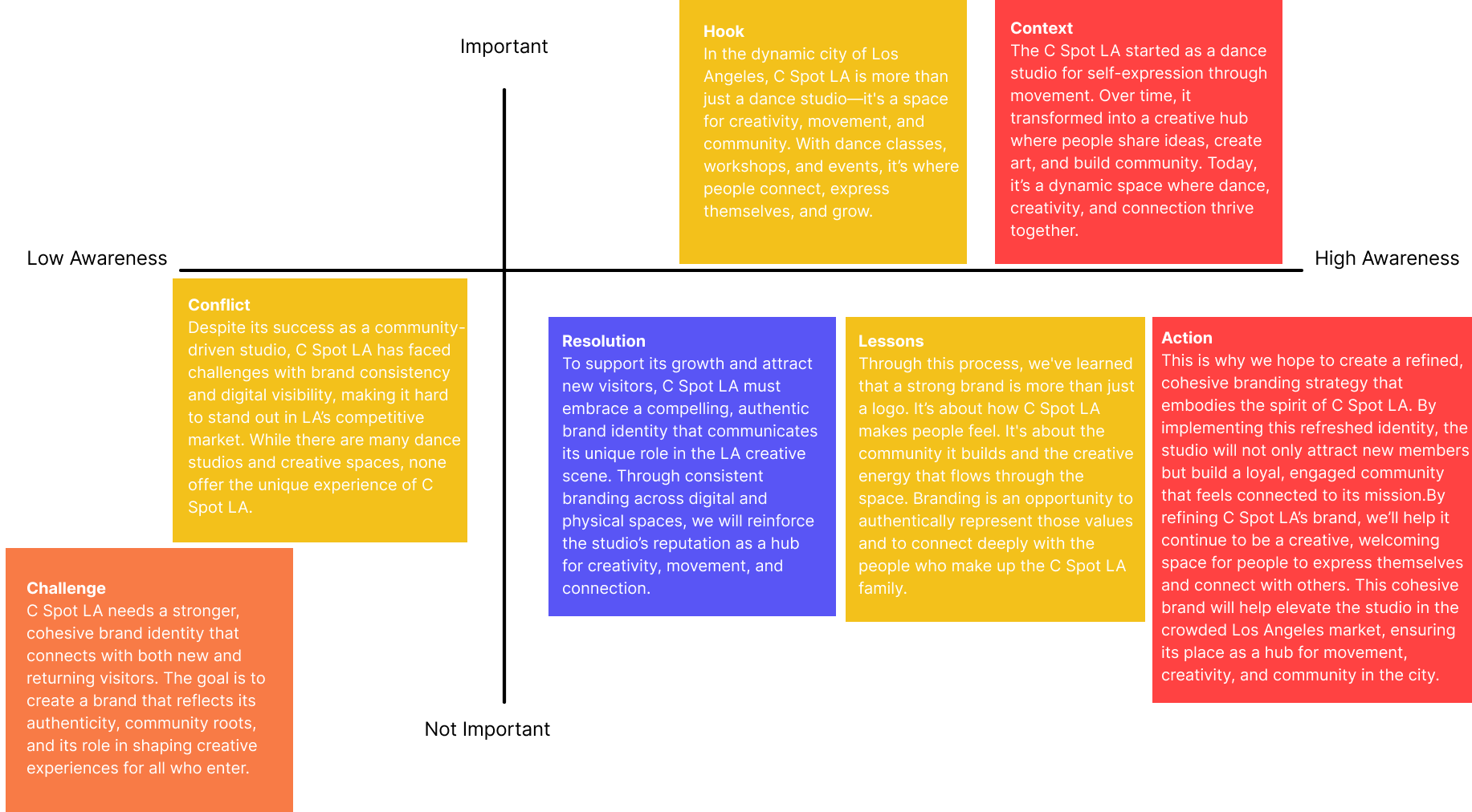
Determining the most important parts of the branding with The C Spot LA’s story also played a vital role with our process.
Team Brainstorm
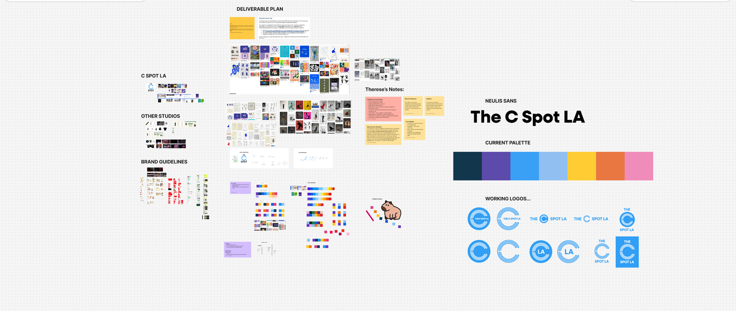
After determining important needs the team brainstormed as one before going into their own projects within the branding via FigJam

Competitive Analysis
Viewing other studio sites allowed to compare and contrast based on the needs of the client, as well as allow for more inspiration for user navigation complications.
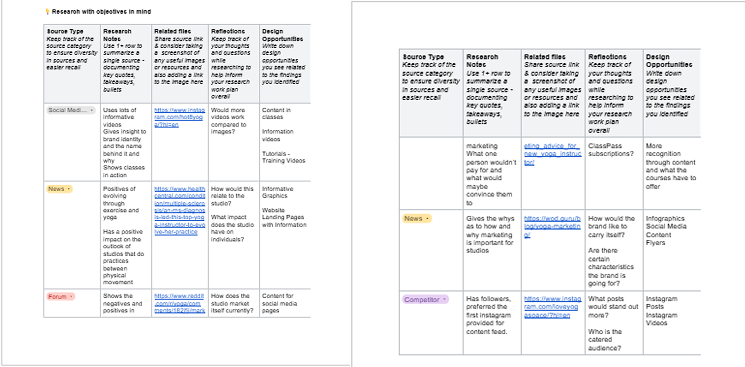
Netnography
Searching different sites and forums also helped grasp what people who attend studios and dance classes usually look for when trying to book classes, which helped in ideating what the website would need as a plus.
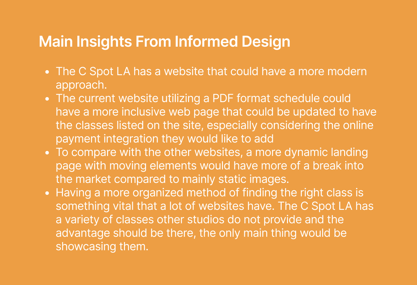
Finalizing Insights
Based on the research, we were able to fully grasp the big picture of what was needed, what could be improved and what could be done despite our constraints.
Design Development
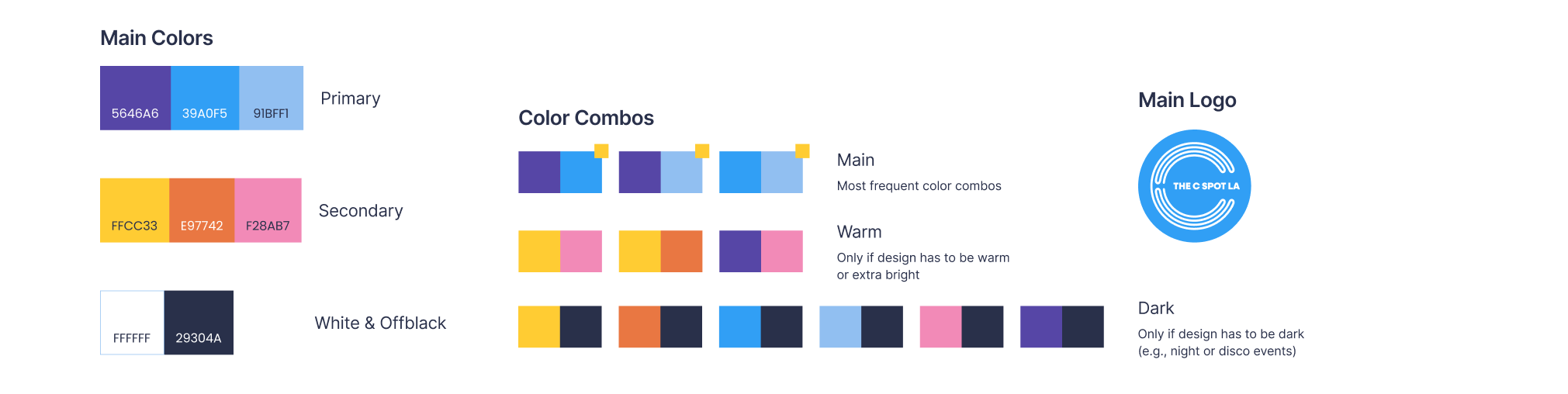
Our digital lead Tyler Lin came up with the brand guidelines, and through collaboration color pairs and matches were made to enhance the experience of The C Spot LA. This itself allowed for the website to be able to be built using the new enhanced logo and the new color palette.
Results
Reflection
This project really introduced collaboration, and finding ways to create even with constraints, whether it be cost or time. The amount of ideas through one single team was something that was very appreciated, and the exchange of feedback as well.
Class Vote
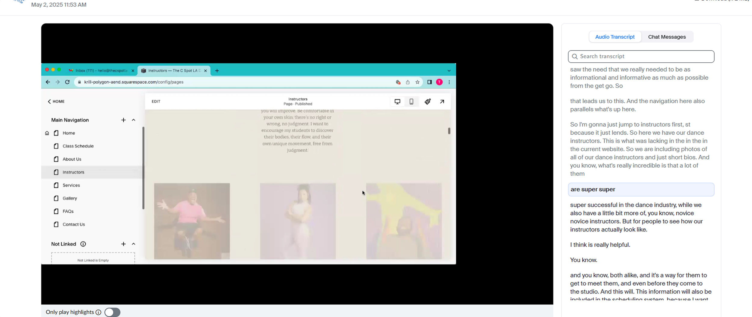
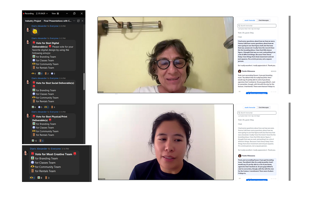
Susan & Yvette From The C Spot LA, via Zoom Giving Review of Branding and Website Redesign
Transcript Reflects Feedback During Last Zoom Session Presentation
Outcome
Based on the collaboration of everyone on the branding team, we received the highest scores through a class vote in different categories. The founders Susan and Yvette both appreciated what our team created for their brand, and seeing how we were able to bring to fruition something that went beyond expectations was a great experience.
Next Steps
Due to time constraints and pricing constraints, where purchasing a subscription was not allowed, the next steps would really be to bring to life more of the website through Squarespace Suite and explore more menus and plugins for ease of booking systems.